The world has gone mobile. Everywhere you look, people are searching, scrolling, and shopping right from their phones. More than 60% of global searches now come from smartphones.
That’s why mobile SEO matters so much today. Google uses mobile-first indexing to decide how your site ranks. If your pages are slow, hard to read, or clunky on smaller screens, you’re already falling behind.
Some great websites struggle simply because they ignored their mobile performance. It’s not just about looking good on a phone. It’s about speed, structure, and usability.
The good news? With the right mobile SEO tools, you can fix all of that.
In this article, I’ll show you the 10 best mobile SEO tools that can help you test, improve, and track your site’s mobile performance.
Let’s get started.
Table Of Contents
- Why Mobile SEO Tools Matter
- Best Mobile SEO Tools to Improve Rankings and Speed
- Rank Math SEO
- Google Search Console
- Google’s Rich Results Test
- Google PageSpeed Insights
- GTmetrix
- WP Rocket
- Imagify
- Chrome Developer Tools
- Bing Mobile Friendliness Test
- Google Analytics
- How to Improve Mobile SEO: Combining Tools for Maximum Impact
- Conclusion
1 Why Mobile SEO Tools Matter
Having a mobile-friendly site is no longer enough. You need to know how your site performs on real mobile devices, how fast it loads, how people interact with it, and how Google sees it. That’s why you need mobile SEO tools.
These tools help you:
- Find what’s slowing your site down
- Fix layout or script issues that break the mobile view
- Track progress and measure real improvements
What looks fine on your laptop can be a nightmare on a phone. A large image or a small layout shift can ruin the experience for mobile visitors. The right tools catch these early before they hurt your rankings or conversions.
They also help you test your fixes, measure your results, and stay ready for Google’s mobile updates. If you want higher rankings and happier visitors, mobile SEO tools make it simple. They save time, eliminate guesswork, and ensure your site performs well on every screen.
2 Best Mobile SEO Tools to Improve Rankings and Speed
There are numerous SEO tools available, but not all of them effectively handle the mobile side.
I’ve narrowed it down to the ones that actually help you improve your site’s mobile performance, speed, and search engine visibility.
2.1 Rank Math SEO
Rank Math is an all-in-one mobile SEO plugin for WordPress designed to optimize your site for both desktop and mobile users.
It handles everything from metadata and Schema to page speed monitoring and indexing, all inside your WordPress dashboard.
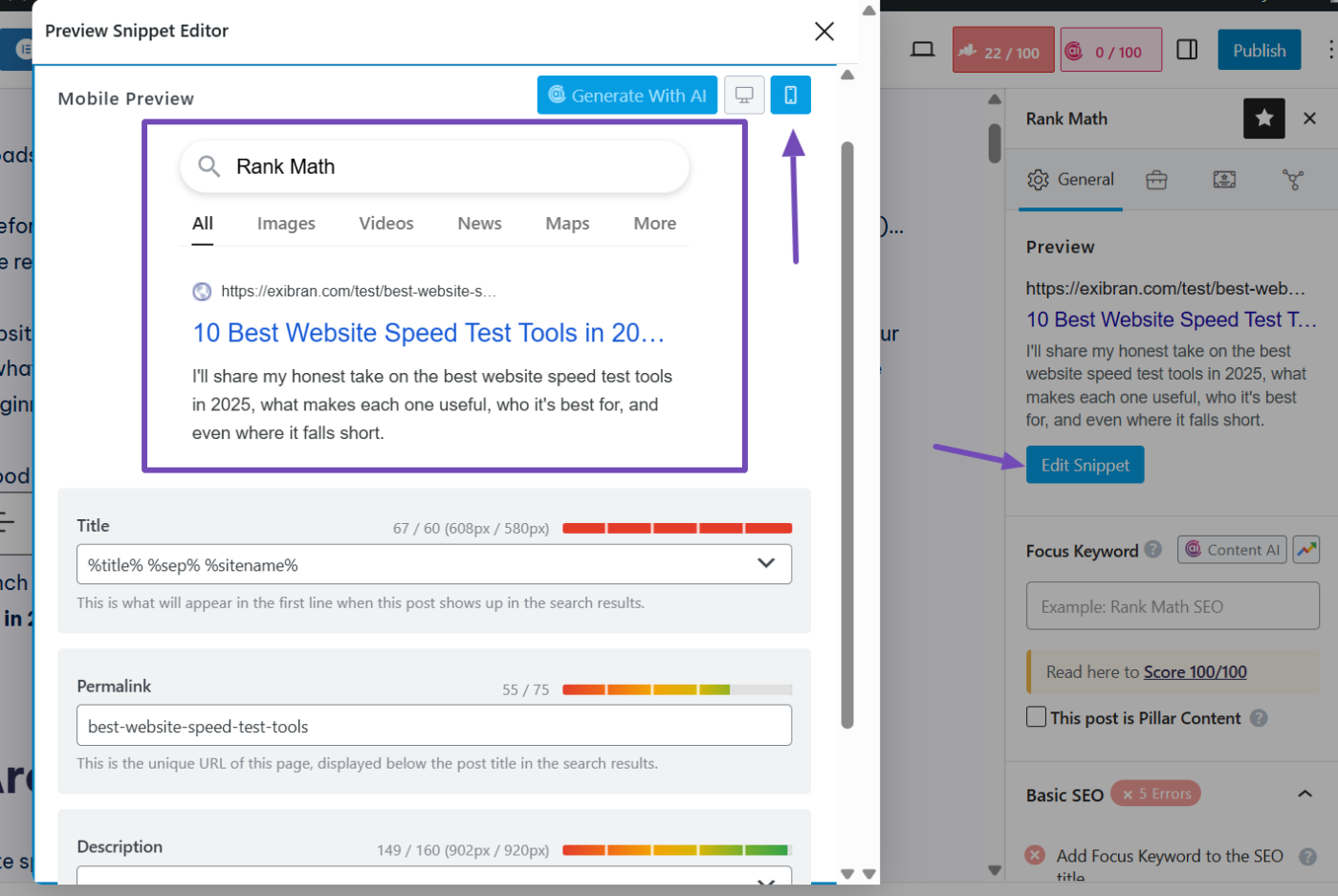
It provides on-page SEO suggestions optimized for both mobile and desktop SERPs. When you navigate to the Rank Math meta box in your WordPress post editor, you’ll see a preview of how your content title, description, and slug will appear in search results.
Click the Edit Snippet button, and you can make changes to this snippet however you prefer. You can even switch the preview between desktop and mobile to see how it appears and make adjustments accordingly.
Now, focusing on the SEO suggestions in the content readability section, Rank Math emphasizes the need for a table of contents, short paragraphs, and multimedia. All of these benefit mobile users.
You can also use its SEO Analyzer to run a complete site analysis and find different ways to optimize your site more for mobile SEO.
The analysis test provides a mobile snapshot of your site so you can see how your content appears on mobile.

Moving to the Performance section, it provides the response time of your page so you can work on your website speed, which benefits mobile visitors as well.

Apart from this, Rank Math comes with other features that help with mobile SEO:
- Its Schema Markup builder helps your pages show enhanced results on mobile SERPs and supports voice search optimization, which matters now that more people use voice assistants to find answers.
- Rank Math shows your post and page speed scores inside WordPress using Google PageSpeed Insights, so you can spot slow pages and fix them fast.
- The built-in Rank Tracker and Google Analytics integration give you a clear view of how your keywords and traffic perform on mobile versus desktop, all from one place.
- Rank Math also includes a Robots.txt editor, which helps you control how search engines crawl your mobile pages, and a 404 monitor with redirection tools that ensure users don’t hit broken pages while browsing on mobile devices.
- If you’re running a business, the Local SEO module is another huge plus. It helps your business show up in local mobile searches and Google Maps.
Pricing: Rank Math is free. The PRO plan starts from $95.88 billed annually.
2.2 Google Search Console
Google Search Console is a tool you can’t afford to overlook. It shows you how your content performs on Google search results, including on mobile devices.
When you visit Google Search Console and navigate to the Performance section, you can monitor your website’s clicks, impressions, click-through rates, and average positions on Google.
The best part? You can filter results by device type to view mobile performance specifically.

You can also check how well your pages perform from a real-user mobile perspective by navigating to the Core Web Vitals section.

Since Google is a mobile-first search engine, all the features in Google Search Console are automatically relevant for mobile SEO. But specifically for mobile, several features stand out:
- The URL Inspection tool allows you to test individual mobile pages to verify indexing, how Google fetches them, and whether mobile elements (such as viewport settings) are set correctly.
- The page and video indexing, which you can use to confirm the status of your videos and pages, and identify any issues.
- Sitemaps, where you can submit your website sitemap for validation.
- And the robots.txt report to confirm that Googlebot isn’t restricted from accessing your site.
If you own a website and want your content to keep performing well on Google without any restrictions, Google Search Console isn’t optional.
Pricing: Free
2.3 Google’s Rich Results Test
The Rich Results Test is a free tool from Google that helps you check whether your structured data is valid and whether your pages are eligible for richer display formats in search results (such as FAQ snippets, product carousels, and more).
Since mobile traffic matters so much, you want your content to look extra good on small screens and stand out in search results.
Visit the tool and add the URL or code snippet from the page with the Schema to test what types of rich results Google’s crawlers detect. Leave the crawling agent as a smartphone to test the mobile viewpoint.

When the test result is ready, the tool shows which rich result types your markup qualifies for and flags errors or missing required properties.
On mobile, attention spans are limited, so you need to confirm if your pages are eligible for featured snippets to appear more visibly (with ratings, images, snippets) and with a clearer structure. This helps increase your click-through rates and user engagement.
Usually, I validate my Schema markups using this tool after adding or updating them with Rank Math on my website.
Pricing: Free
4.2 Google PageSpeed Insights
I turn to Google PageSpeed Insights (PSI) whenever I need a quick and reliable check on how my pages perform on mobile devices.
I check how fast they load, how stable they feel, and whether users are having a smooth experience. It’s one of the easiest tools to spot mobile performance issues that matter for SEO.
PageSpeed Insights gives you both lab data (simulated mobile network and device) and field data (actual user experience via the Chrome UX Report) for the mobile version of a page.
When you enter the URL you want to test and run the test, it reports on critical metrics from Core Web Vitals, specifically Largest Contentful Paint (LCP) and Cumulative Layout Shift (CLS), which are now gold standards for mobile UX.

When you scroll down further, the tool provides specific diagnostics, including lists of issues flagged (unused JavaScript, large images, render-blocking resources) for you to fix.
You know why this tool is essential? Several people browse and visit sites using their phones. If they visit your page and it takes too long to display the main content (high LCP), or elements shift around while loading (bad CLS), you’ll hurt both engagement and SEO.
With the help of this tool, you can easily identify those exact weak spots and fix them. This is one of the most effective tools to improving mobile page speed.
Pricing: Free
2.5 GTmetrix
GTmetrix is a powerful mobile speed test tool that I use as an alternative to PageSpeed Insights. It goes beyond just desktop speed.
For mobile SEO in particular, it lets you simulate how your site loads on phones (and mobile networks) so you can spot realistic bottlenecks and user experience issues that could hurt your rankings.
Here are some of its essential features that stand out for mobile SEO:
- Simulated Device Testing: GTmetrix allows you to choose from over 40 different mobile devices (via a “Simulate Device” setting) so your site is analyzed as if it’s being loaded by that phone. This includes screen resolution, device pixel ratio, and mobile user agent.
- Network Throttling & Location Options: You can simulate slower mobile connections (3G, 4G, LTE) and test from different global locations to match your real mobile audience environment.
- Detailed Breakdown & Waterfall Charts: GTmetrix gives a waterfall view of all resource requests (images, JS, CSS) and flags things like render-blocking scripts or large images that slow mobile load times.
- Historical Monitoring & Alerts: For ongoing tracking, you can set up scheduled tests and alerts when performance dips. This is useful for monitoring mobile performance over time.

To get the best out of GTmetrix for mobile SEO, when you run a test, switch the “using” dropdown to a mobile device setting (for example, “iPhone 13/Chrome”) and throttle the connection to a 4G or 3G speed setting.
Then focus on the waterfall chart. Look for large images (over 500 KB), scripts that block rendering, or third-party embeds that delay loading. Fix those first. Re-run the test after your changes to see if mobile performance improves.
Please note that this may require a PRO version to utilize these advanced options effectively.

Pricing: Starts from $5 per month.
2.6 WP Rocket
I rely on WP Rocket when I want to turn my WordPress site into a lean, fast-loading mobile experience. It handles caching, code and image optimization, and mobile-friendly delivery so my phone users aren’t left waiting while desktop users zoom ahead.
When you activate the WP Rocket plugin on your WordPress site, it enables the mobile cache feature. This helps it serve cache files specifically for mobile devices, ensuring that visitors on phones get a version optimized for their device.
It also offers minification of CSS/JS, deferring JavaScript execution, and optimizing CSS delivery, all of which directly reduce load time and delays on mobile.

You can also enable WP Rocket to load images, videos, and iframes only when needed (lazy loading), which saves bandwidth and improves the perceived speed of mobile pages.
Because mobile devices tend to have slower connections, less processing power, and smaller screens, every extra second or layout shift matters. WP Rocket helps you:
- Serve a lighter, mobile-optimized version of your pages so they load faster on phones.
- Reduce render-blocking scripts and large files that cause metrics like LCP and CLS to deteriorate on mobile devices.
- Improve user engagement and reduce bounce rates from mobile devices, both of which help your overall SEO performance because Google uses mobile experience as a ranking signal.
Pricing: Starts at $59/year for one website.
2.7 Imagify
Imagify is another mobile optimization tool you won’t want to miss. I use Imagify when I want to make my images lightweight and mobile-friendly.
It handles image compression, conversion to modern formats (WebP/AVIF), and automatic optimization, ensuring the visuals on my mobile pages don’t drag the entire experience down.
Imagify comes with several features that will benefit your mobile site visitors:
- It compresses images without visible quality loss, reducing file size significantly and improving loading speed.
- It supports automatic conversion to next-gen formats like WebP and AVIF, which especially matter for mobile devices because they load faster and use less data.
- It offers two compression levels (Smart and Lossless) so you can balance image quality and file size.
- Bulk optimization and background processing mean you can optimize your existing image library without downtime and automatically optimize new uploads.

On mobile devices, every kilobyte and millisecond counts. Large images that load slowly can negatively impact metrics such as LCP and cause layout shifts that affect CLS. With the Imagify plugin installed, you can compress and convert these images to lighter formats.
This improves page load times, enhances user experience, and contributes to better mobile SEO performance and rankings.
Pricing: Imagify is free. The Growth plan is available for $4.99/month (billed annually).
2.8 Chrome Developer Tools
Chrome Developer Tools (DevTools) is one of the most powerful and free responsive testing tools built right into Google Chrome.
For mobile SEO, it’s incredibly useful because it lets you preview, inspect, and debug how your website appears on different mobile devices in real time.
Visit the page on Chrome, right-click anywhere on the page, and select Inspect (or press Ctrl + Shift + I on Windows / Cmd + Option + I on Mac).
Navigate to the Dimensions tab, where you can switch between various screen sizes and resolutions, such as iPhone, Samsung Galaxy, and iPad, to see how your page layout, fonts, buttons, and navigation elements adapt.
This helps ensure your website is fully responsive and provides a seamless experience across all screen sizes.

By testing your site across different devices, you can make sure your design is fast, readable, and responsive, which directly improves your mobile SEO.
You can also run Lighthouse audits directly within DevTools to check Core Web Vitals, SEO, accessibility, and best practices for mobile devices. This is a great way to conduct a mobile usability test.

Pricing: Free
2.9 Bing Mobile Friendliness Test
The Bing Mobile Friendliness Test is a tool provided by Microsoft through Bing Webmaster Tools that allows you to check how well your site performs from a mobile indexing perspective on Bing.
When you type in your URL in the tool and analyze:
- It checks whether your pages meet mobile usability standards for Bing’s crawler and how they might be rendered on mobile devices.
- It focuses on aspects such as responsive design, viewport settings, text readability without zooming, and whether clickable elements are sized for touch interaction.

Because mobile traffic is huge, you don’t want to leave any major search engine behind. If your mobile site performs well on Google but struggles on Bing’s mobile index, you’re missing out on potential visibility.
Pricing: Free
2.10 Google Analytics
I use Google Analytics to track exactly how my site performs on mobile devices. It helps me understand what mobile visitors do after landing on my pages, how long they stay, and whether they take action or just bounce.
You can find this when you log in to GA and navigate to Engagement → Landing page from the menu and click the Add Comparison button at the top. Then select Mobile traffic.
Now, you’ll see how much of your traffic comes from mobile devices and how it performs compared to desktop traffic. You can check metrics such as bounce rate, average session duration, and conversions to identify areas for improvement.

Why is this important? Your site might look good and even load fast, but if mobile visitors don’t stay or convert, you’re still losing. Google Analytics helps you spot those weak spots so you can make real improvements.
Whether it’s a poor layout, slow load time, or confusing navigation, the data will show you what to fix. Over time, these small improvements accumulate and directly enhance your SEO and user experience.
Pricing: Free
3 How to Improve Mobile SEO: Combining Tools for Maximum Impact
When it comes to mobile SEO, no single tool does it all. The real power lies in combining a few of them and letting each one play its part.
I like to treat Rank Math as the control center that brings everything together. It handles the core setup, including metadata, Schema, sitemaps, analytics connections, and even local SEO optimization.
From there, I connect Google Search Console to track how my mobile pages perform in search results and spot any usability issues early.
PageSpeed Insights and GTmetrix help me test and fine-tune performance, ensuring my pages load quickly and run smoothly on all devices, including smaller screens.
Once I’ve completed the technical fixes, I check Google Analytics to see how those changes affect real user behavior, including metrics such as bounce rate, engagement, and conversions from mobile users. If I see improvements there, I know my adjustments are working.
You may also want to try this combination, as these tools cover every aspect of mobile SEO. This mobile SEO checklist approach ensures you’re testing, optimizing, and tracking everything that matters.
4 Conclusion
Mobile SEO is no longer just about having a responsive site. Today, it’s about providing mobile users with the fastest, smoothest, and most helpful experience. The right tools make all the difference.
By combining Rank Math, Google Search Console, PageSpeed Insights, and Google Analytics, you can set up your site properly, monitor performance, and fine-tune every detail that affects mobile user experience and rankings.
Consistently using these tools, tracking results, and improving your mobile experience will naturally boost both traffic and search rankings.
Search engines reward websites that prioritize users, and optimizing for mobile is one of the most effective ways to do that.
If you found this guide helpful, let us know by Tweeting @rankmathseo.