Effective website navigation is important for two key reasons: it enhances the user experience and supports SEO performance.
For visitors, intuitive navigation makes it easier to find what they’re looking for, leading to increased engagement and conversions. For search engines, a clear and structured navigation setup helps them understand your site’s layout, improving indexability and rankings.
So, how can you optimize your site’s navigation to benefit both users and search engines?
In this post, we’ll walk you through the best practices for website navigation to improve usability and boost your site’s SEO. Let’s dive in.

Table Of Contents
- What is Website Navigation?
- Importance of Website Navigation
- Common Website Navigation Components
- Best Practices for Website Navigation
- Create a Logical Hierarchy
- Use Descriptive Navigation Labels
- Maintain Consistency Across All Pages
- Include Breadcrumbs
- Cross-Link Relevant Pages
- Include a Clear Call to Action
- Multilingual Site Navigation
- Don’t Hide Navigation
- Create User-Friendly Mobile Navigation
- Track Navigation Performance With Heatmaps
- Frequently Asked Questions
- Conclusion
1 What is Website Navigation?
Website navigation refers to the links, menus, and other interactive elements (e.g., buttons, dropdowns, and search bar) that help your audience move around and interact with your website.
It includes the various menus, links, and other navigational tools that guide the audience through the content and features of a site.
Effective navigation is essential for delivering a smooth user experience—it ensures visitors don’t get lost and can quickly find what they need.
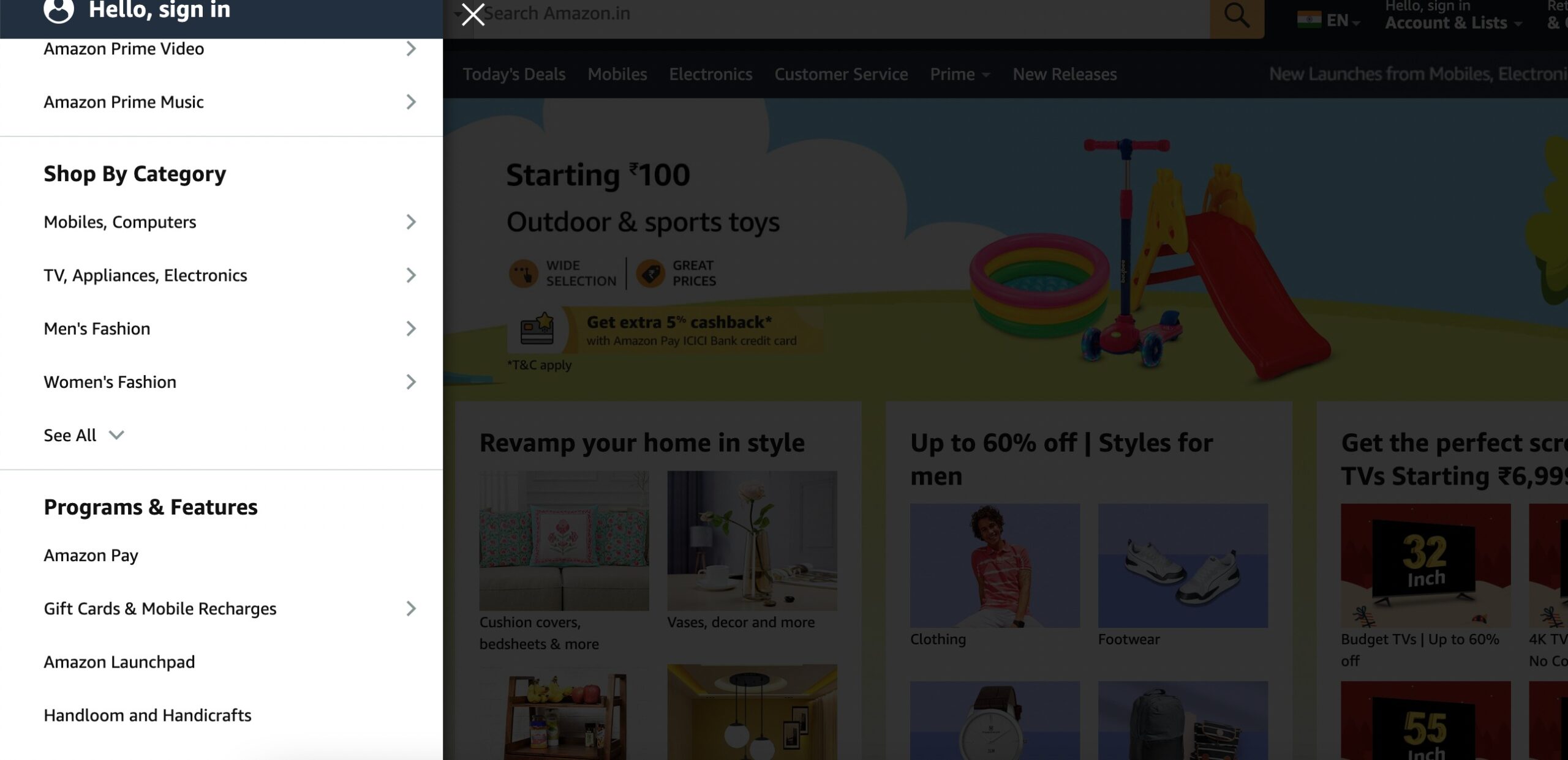
Consider an online retail website like Amazon. The homepage features a prominent menu bar offering categories like Electronics, Books, and Clothing. Visitors can further navigate through subcategories within each category or use the search bar for specific products. Additionally, product pages include clear calls-to-action (CTAs) like Add to Cart for appropriate navigation through the shopping process.
2 Importance of Website Navigation
Search engines like Google evaluate both the quality of your content and the overall user experience when deciding how well your website matches a user’s search intent.
A clear and well-organized navigation system plays an important role in this process. It helps visitors easily explore your site, find the information they need, and engage with your content, leading to lower bounce rates and longer time on site. These positive user signals tell search engines that your website is valuable and user-friendly.
From a technical perspective, effective navigation also helps search engine crawlers index your site more efficiently. When your navigation is structured logically, crawlers can better understand the hierarchy of your pages and the relationships between them. This increases the likelihood of more pages being indexed and ranking.
Good navigation also supports internal linking, which spreads link equity across your site and reinforces topical relevance. When implemented strategically, this can help boost the visibility of deeper pages in search results.
In addition, structured navigation can contribute to enhanced SERP features like sitelinks or breadcrumb trails, improving your click-through rates and overall SEO performance.
Ultimately, modern SEO goes beyond keywords. It involves delivering a smooth, intuitive experience that aligns with Google’s E-E-A-T principles—Experience, Expertise, Authoritativeness, and Trustworthiness—and navigation is a core part of that experience.
3 Common Website Navigation Components
Let us discuss the common navigation components to help you build your website.
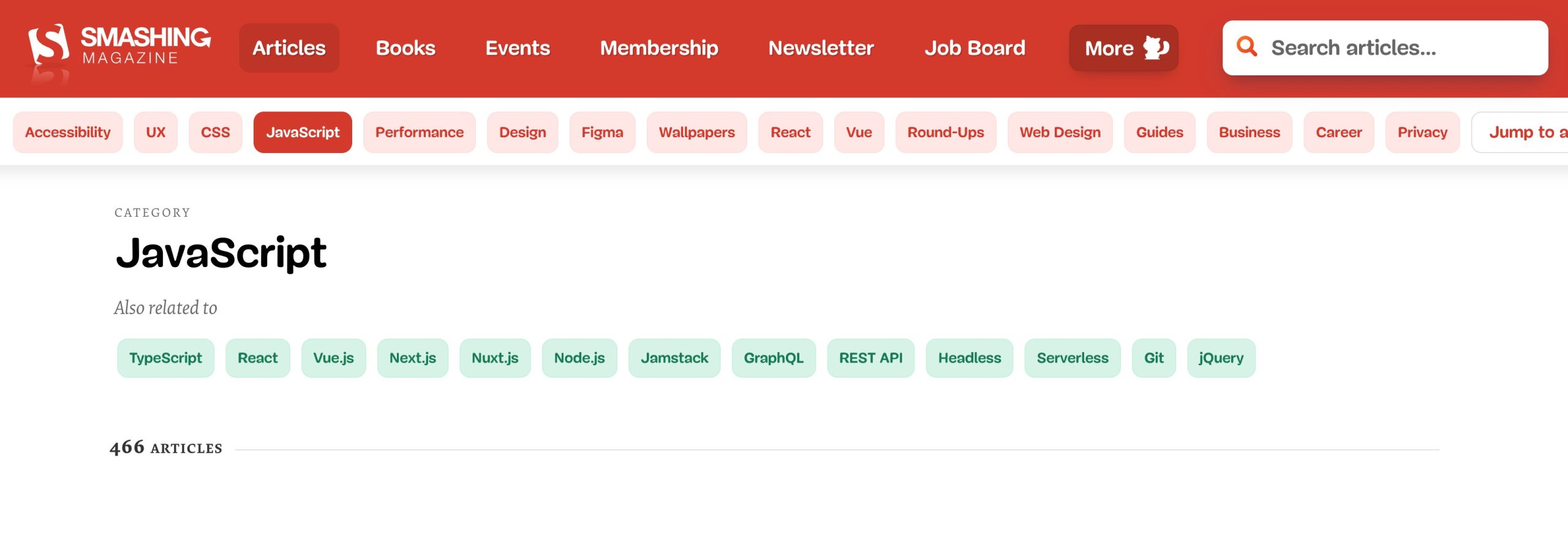
3.1 Navigation Menus
Navigation menus are essential components of web design, providing a structured way for audiences to access different sections of a website.
They can be horizontal or vertical and typically appear at the top or sides of a webpage.
For example, a horizontal menu on an e-commerce site may include categories like Electronics or Clothing, guiding the audience to specific product pages.

3.2 Dropdown Menus
A dropdown menu is a navigational feature that reveals a list of sub-menu items when a user hovers over or clicks on a main menu item.
It helps organize content hierarchically, making it easier for users to explore deeper sections of a website without cluttering the main navigation bar.
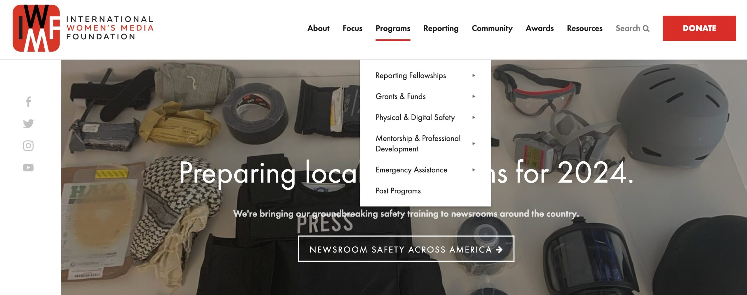
These menus optimize space, reduce clutter, and contribute to a more user-friendly browsing experience.
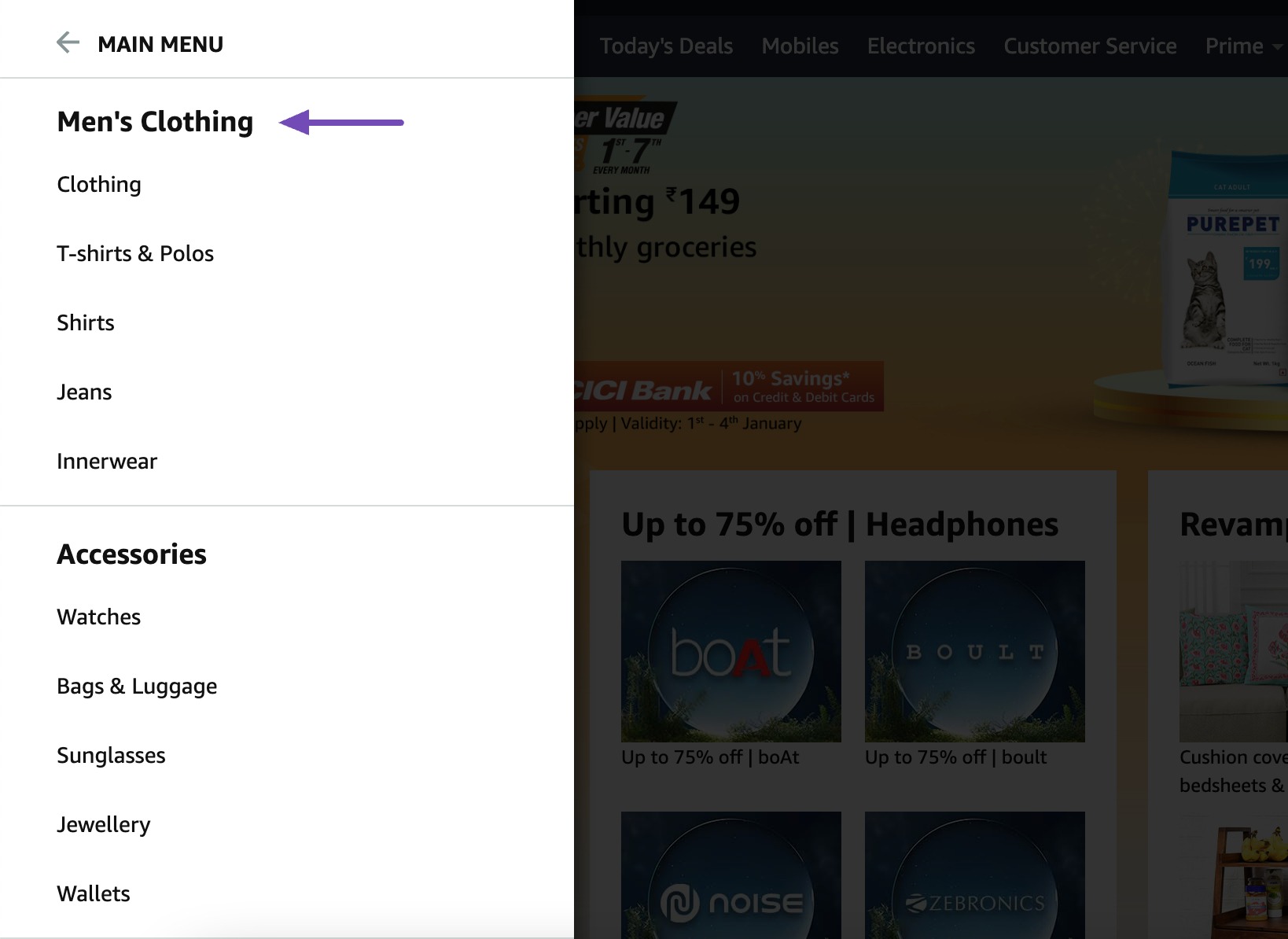
3.3 Hamburger Menus
A hamburger menu is a navigation icon—usually represented by three horizontal lines (☰)—that, when clicked or tapped, expands to reveal a hidden menu or navigation drawer.
It’s widely used in mobile and responsive web design to save space and keep interfaces clean.
Selecting the icon may expand options like About Us, and Contact.
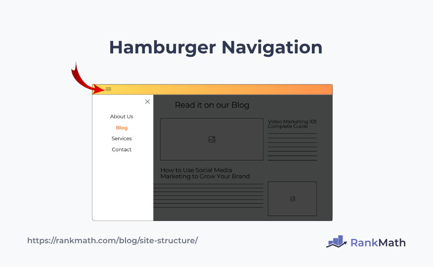
Hamburger menus streamline navigation, especially on smaller screens, offering a clean and unobtrusive design while maintaining easy access to essential content.
3.4 Tabbed Navigation
Tabbed navigation is a user interface pattern where content is divided into multiple sections—each accessible by clicking or tapping on labeled tabs.
Only one section of content is visible at a time, and switching tabs reveals different content within the same area of the page.
For instance, on a news website, tabs might represent categories like Politics, Sports, and Entertainment. Clicking on each tab displays relevant content while maintaining a clean and user-friendly layout.
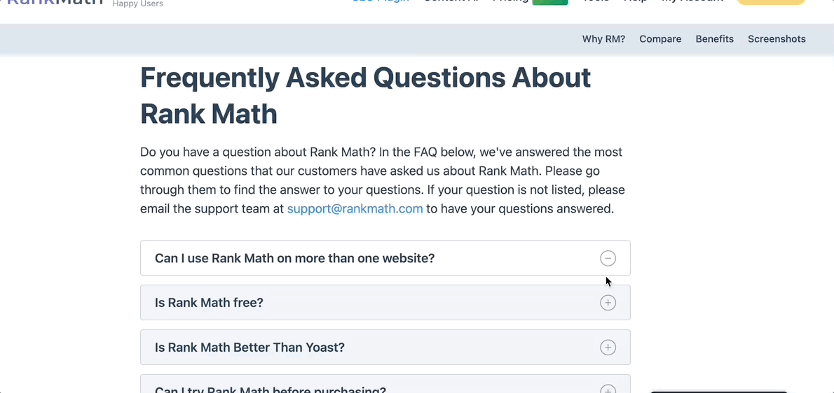
3.5 Accordion Navigation
Accordion navigation is a vertical, collapsible menu structure that expands to reveal content or submenus when a user clicks on a section. It allows users to interactively open and close panels, displaying only one or a few content blocks at a time while keeping the rest hidden.
For instance, each question can be a header on an FAQ page, and clicking on it reveals the corresponding answer, minimizing clutter.
4 Best Practices for Website Navigation
Let us now discuss the best practices for website navigation.
4.1 Create a Logical Hierarchy
Organizing your website with a clear hierarchy is one of the most important steps in creating intuitive navigation—for both users and search engines.
Start with broad, high-level categories (like “Services” or “Products”) and branch out into more specific subcategories. This top-down structure helps users understand how your content is grouped, making it easier to find what they’re looking for without frustration.
From an SEO perspective, a logical hierarchy improves crawlability and helps search engines interpret the importance and relationship between different pages. It also supports stronger internal linking, enhances breadcrumb navigation, and improves the chances of sitelinks appearing in search results.
Keep your navigation depth shallow—ideally no more than 3 levels deep. This ensures content is easily discoverable by both users and bots.
4.2 Use Descriptive Navigation Labels
Clear, descriptive labels in your website navigation help both users and search engines understand what each section of your site offers.
Instead of vague terms like Products or Services, use specific labels such as Men’s Running Shoes or Digital Marketing Services. This not only improves usability—by setting clear expectations for users—but also helps search engines better interpret the page’s relevance to search queries.
4.3 Maintain Consistency Across All Pages
A consistent navigation structure across all pages is key to delivering a seamless user experience. When menus, labels, and layouts remain uniform throughout your site, visitors can quickly learn how to get around, no matter what page they’re on.
This familiarity builds trust and reduces friction, encouraging users to explore more content and stay longer. Whether they’re browsing on desktop or mobile, a consistent interface ensures they won’t have to relearn how to navigate.
From an SEO perspective, consistency helps search engine crawlers follow a predictable path through your site. It improves crawl efficiency, supports better internal linking, and helps distribute link equity evenly, boosting your chances of ranking across multiple pages.
Keep your main menu, footer links, and navigation labels uniform across all templates—even blog posts and landing pages—to avoid confusion and reinforce your site’s structure in the eyes of both users and search engines.
4.4 Include Breadcrumbs
Breadcrumbs are a simple yet powerful way to improve both navigation and search performance. They appear near the top of a page and show users the path they’ve taken from the homepage to their current location, making it easy to backtrack to broader categories.
For instance, if you’re viewing a specific product like Sports Shoes > Men’s Collection, the breadcrumb trail would read Home > Footwear > Sports Shoes > Mens Sport Shoes.
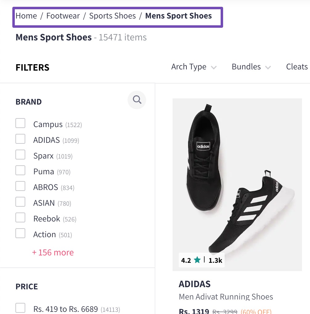
Each level in the breadcrumb should be clickable, allowing users to easily jump back to higher-level categories without relying on the back button. This enhances the user experience, particularly on large e-commerce sites.
Rank Math makes it very easy to add breadcrumbs to your website. To do so, navigate to Rank Math SEO → General Settings → Breadcrumbs and enable the Enable Breadcrumbs function. If Breadcrumbs settings are unavailable, ensure you’ve switched to the Advanced Mode in Rank Math.
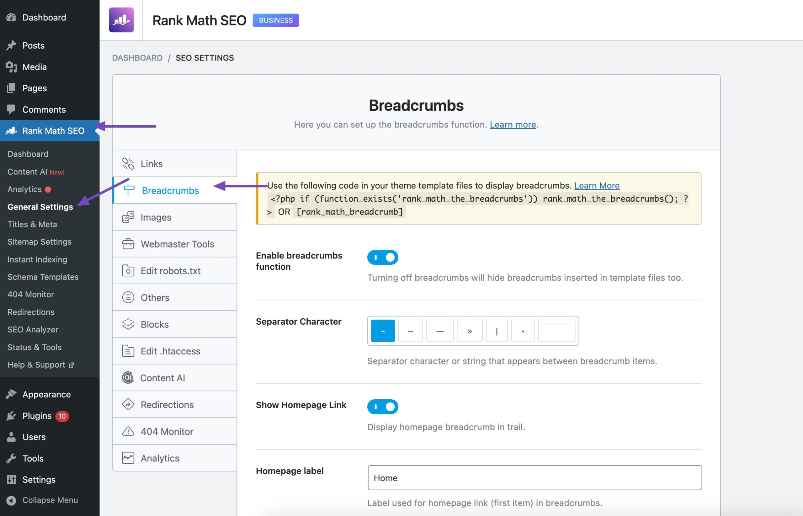
Once Breadcrumbs is activated and placed inside your website using the shortcode or using the function, Rank Math automatically adds the Schema code.
To configure all the settings relevant to Breadcrumbs, please refer to our detailed documentation on Breadcrumbs.
4.5 Cross-Link Relevant Pages
Strategic internal linking, also known as cross-linking, involves connecting related pages within your website to guide users and search engines through your content more effectively.
For instance, on an e-commerce site, a product page for Running Shoes can be cross-linked to pages on Athletic Socks or Running Gear, guiding audiences to complementary products.
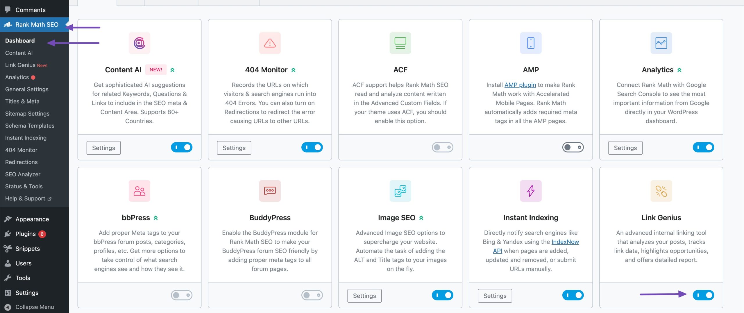
Rank Math’s AI Link Genius provides recommendations that are contextually relevant, topically aligned, and consistent with SEO best practices. To do so, enable the Link Genius module, as shown below.
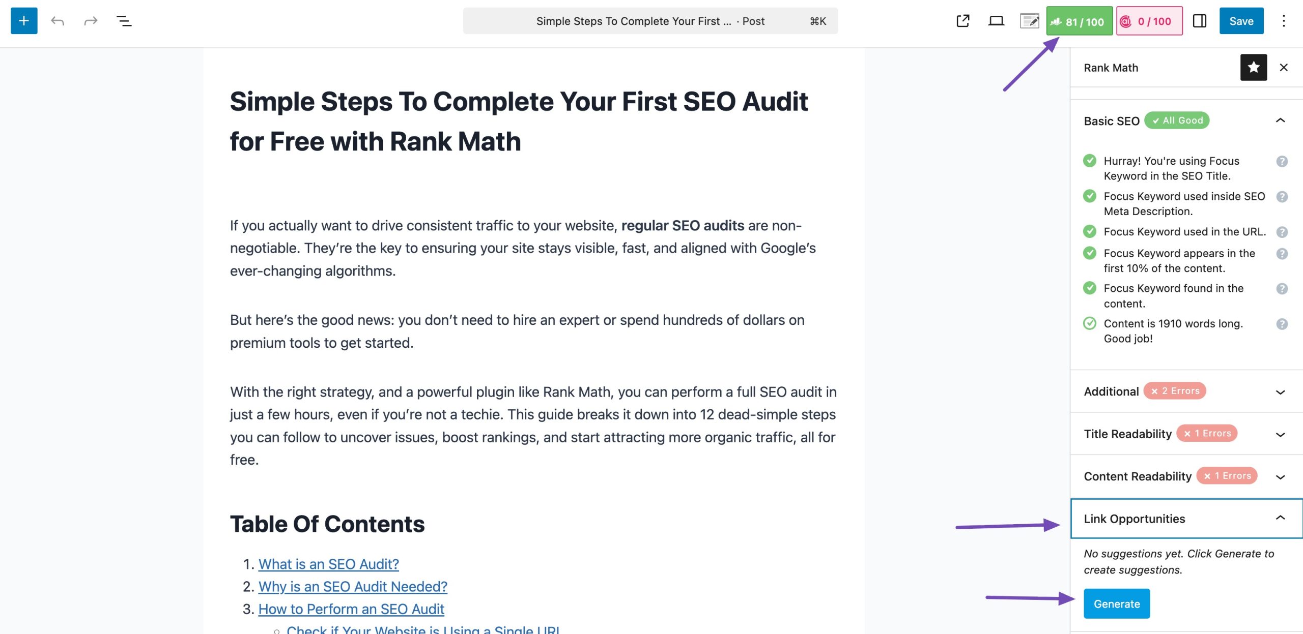
Next, click the Rank Math SEO icon in the post editor and open Link Opportunities, then click Generate to view suggested internal links. You can either copy the link URL or insert it directly into your content with one click.
From an SEO perspective, cross-linking:
- Helps search engine bots crawl and index your site more efficiently
- Distributes link equity to deeper or high-value pages
- Strengthens topical relevance by building content clusters around core topics
Ultimately, thoughtful cross-linking boosts both user engagement and page rankings, making it a must-have in your site’s navigation strategy.
Don’t overdo it. Focus on relevance and user intent. Avoid stuffing links just for SEO; each link should genuinely add value.
4.6 Include a Clear Call to Action
Adding a call to action (CTA) in your website’s navigation can be an effective way to guide users toward your most valuable conversion goal, such as signing up, starting a free trial, or downloading a product.
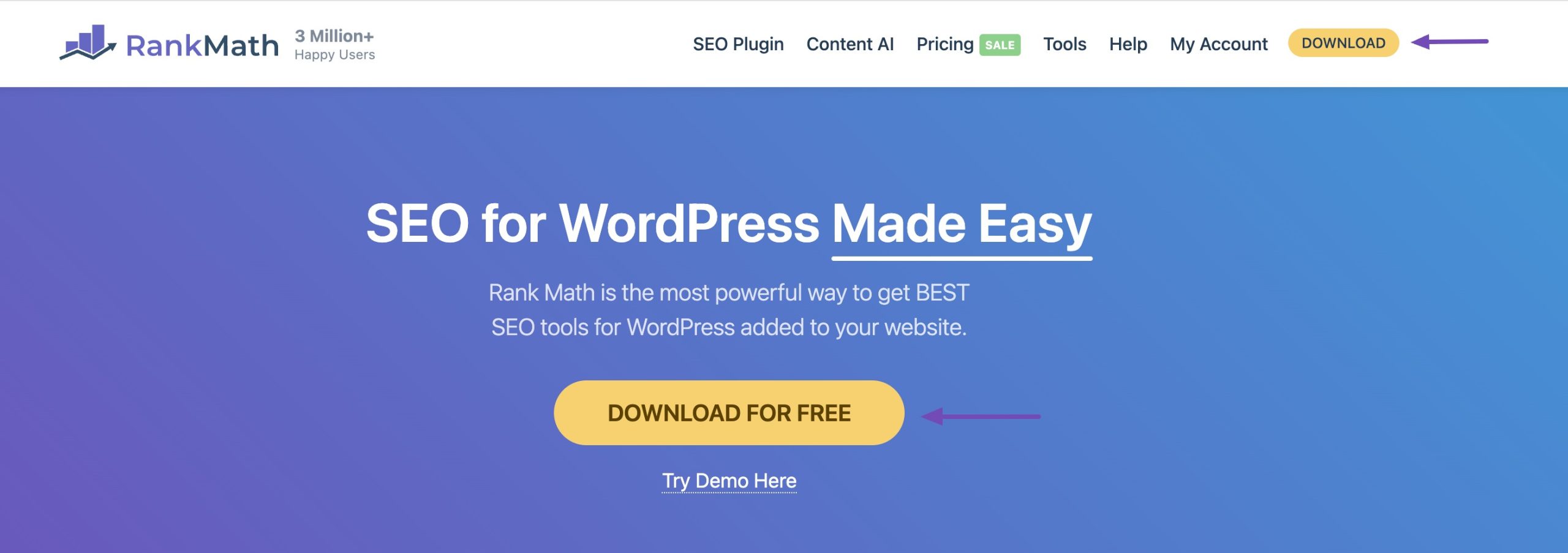
For example, on our Rank Math website, the primary navigation includes a prominent CTA button, such as Download. This encourages users to take immediate action and download our plugin.
When a CTA Works Well in Navigation:
- SaaS tools (e.g., Rank Math, Grammarly): A bright, actionable button like Start Free Trial or Download Plugin helps users engage faster.
- Service-based sites: A CTA like Book a Consultation or Get a Quote in the header streamlines lead generation.
- Course platforms: Enroll Now or Join the Free Webinar in the nav bar improves conversions.
When to Avoid CTAs in Navigation:
For large content-heavy or e-commerce sites like Amazon, it’s generally not recommended to include a single, dominant CTA in the primary navigation. That’s because:
- Users have multiple intents: shopping, browsing, comparing, and managing orders.
- Over-prioritizing one action (like Buy Now) can disrupt the natural shopping flow.
- Instead, Amazon focuses on personalized suggestions, well-categorized menus, and contextual CTAs throughout the user journey.
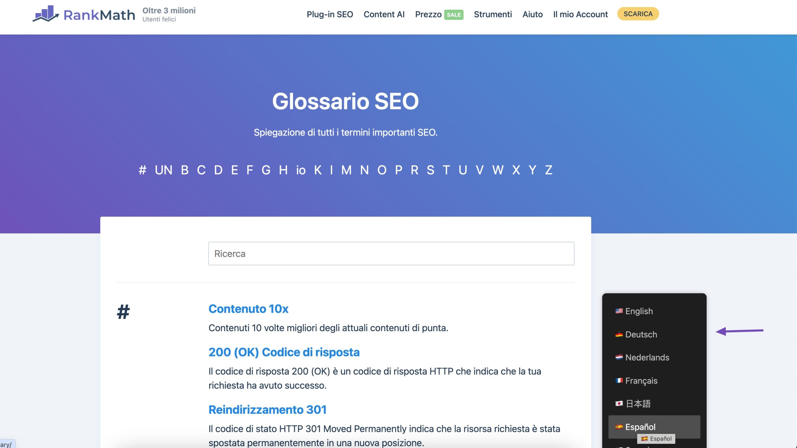
4.7 Multilingual Site Navigation
Multilingual site navigation ensures that users from different language backgrounds can easily browse your website in their preferred language. This involves translating not just the content, but also navigation menus, buttons, etc.
To support international SEO, it’s essential to use hreflang tags. These tags signal to search engines which version of a page should be shown to the visitors based on their language and geographic location.
Implementing hreflang tags in WordPress can be daunting for non-coders. However, using Weglot Translate and Rank Math SEO plugins simplifies the process.
To learn more about adding hreflang tags to your WordPress website using Weglot and Rank Math SEO, refer to our step-by-step guide.
For instance, if you have separate pages for English and French, hreflang tags help Google serve the correct version to the right audience, reducing duplicate content issues and improving your site’s visibility in international search results.
For instance, Rank Math uses proper multilingual navigation to serve global audiences effectively.
4.8 Don’t Hide Navigation
Hiding your site’s navigation, especially on desktop or mobile, can frustrate users and lead to higher bounce rates. If visitors can’t easily find where to go next, they’re more likely to abandon the site without engaging.
Whether you’re using a traditional top menu or a hamburger icon on mobile, your navigation should always be visible and accessible. Clear, prominent menus give users confidence in navigating your site, enhancing their overall experience.
Poor navigation visibility reduces engagement metrics, such as time on site and page views, which are factors that search engines consider when ranking pages. It may also limit the discoverability of deeper content, as users (and crawlers) won’t follow hidden links.
Pro Tip: Use a sticky header to keep your main navigation in view as users scroll, especially helpful on long-form content and mobile screens.
4.9 Create User-Friendly Mobile Navigation
With the majority of web traffic now coming from mobile devices, creating an intuitive mobile navigation is essential for both user experience and SEO.
A mobile-friendly menu should be easy to access, quick to interact with, and optimized for smaller screens. Use clear, concise menu labels and prioritize the most important links—so users don’t have to dig to find key content.
The hamburger icon (☰) is a popular choice for mobile menus because it saves space and keeps the layout clean. However, ensure it’s easy to spot and clearly signals that it opens a menu—pairing it with a Menu label or animation can improve engagement.
To prevent overwhelming users, use collapsible submenus to organize nested pages and keep the interface tidy. Ensure tap targets are large enough for fingers and that navigation is responsive across all screen sizes.
4.10 Track Navigation Performance With Heatmaps
Heatmaps visually represent user behaviour on your website by tracking clicks, taps, scrolls, and mouse movements. Warmer colours (red, orange) show high activity, while cooler colours (blue, green) indicate less interaction.
When applied to your navigation menu, heatmaps reveal:
- Which menu items users click on the most (and the least)
- Whether visitors are ignoring key CTAs or links
- How well your mobile vs. desktop menus are performing
- If dropdowns, submenus, or sticky headers are actually being used
You can use Hotjar to track your site navigation. Once you sign up, add the verification code to your website and Hotjar will start tracking your website.
It provides heatmaps to show where users click or tap, session recordings to watch real-time user journeys, and feedback tools to collect direct input.
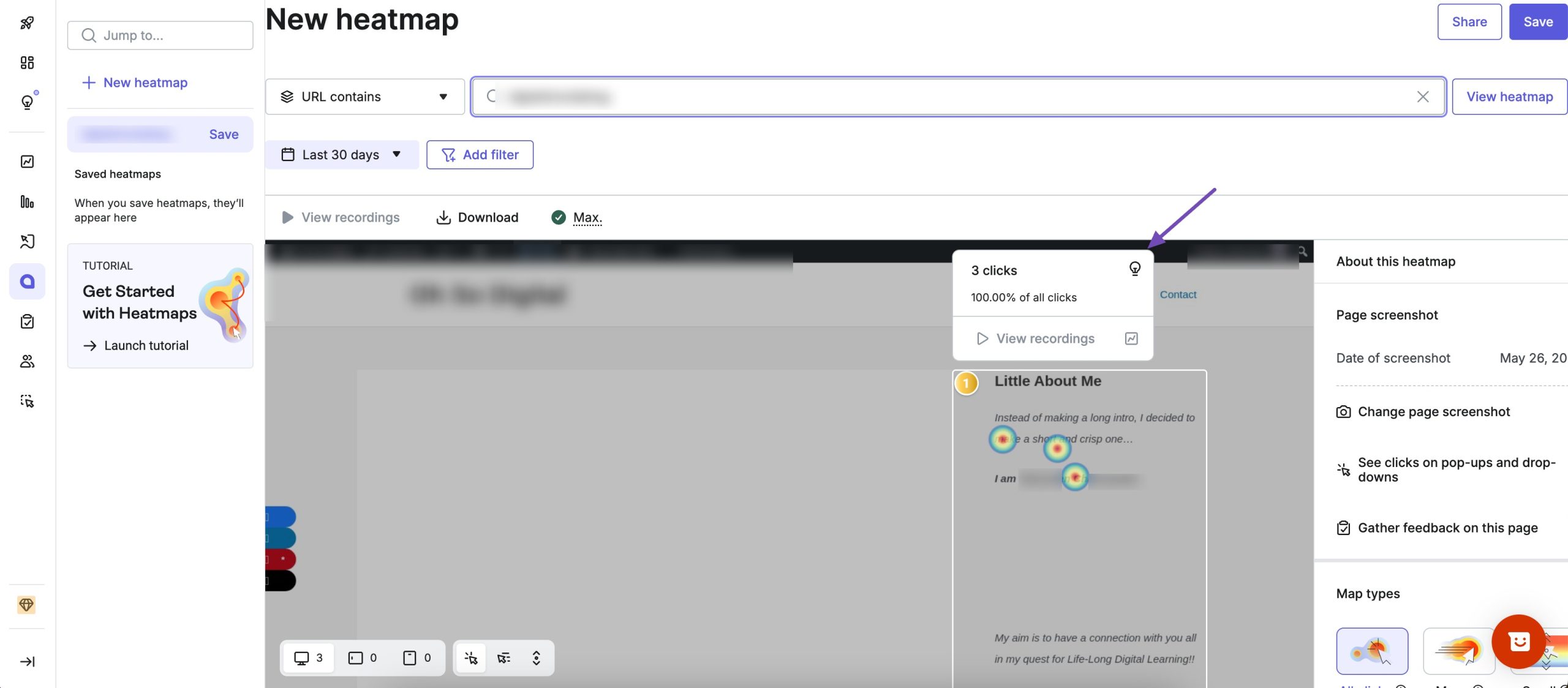
By using Hotjar, you can identify which navigation links are performing well, where users get stuck, and how to improve menu layouts for better usability.
5 Frequently Asked Questions
Why is good navigation important?
Good navigation improves user experience, reduces bounce rates, boosts engagement, helps search engines crawl your site, and can positively impact SEO and conversions.
Should my navigation include every page?
No, include only high-priority, key sections. Too many links can overwhelm users and dilute SEO value. Use internal linking within content instead for deeper pages.
How often should I update my navigation?
Update navigation when you add major sections, restructure content, or notice user analytics indicating navigational confusion or poor engagement.
6 Conclusion
Implementing effective website navigation is not just about creating a good user experience; it is fundamental to successful SEO practices.
A well-thought-out navigation structure enhances user satisfaction, reduces bounce rates, and encourages prolonged engagement with the content.
Simultaneously, search engines rely on intuitive navigation to crawl and index a website efficiently, influencing its visibility and ranking in search results.
By prioritizing logical hierarchy, using descriptive labels, and ensuring consistency across pages, websites can significantly enhance user experience and SEO performance.
Start with your users in mind, and your search visibility will follow.
Which practices do you follow for website navigation? Let us know by Tweeting @rankmathseo.