Some websites are easy to explore, while others feel confusing and disorganized. The difference often lies in how the content is structured.
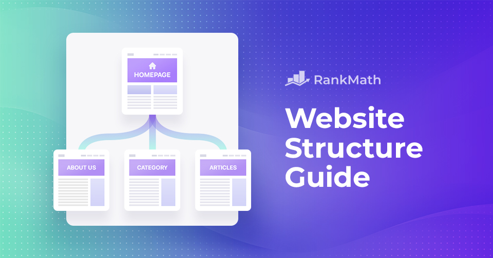
Good website structure does more than organize pages, it creates a smooth experience for visitors and helps search engines understand your site better.
In this guide, we’ll walk through what makes an effective website structure and how you can build one that works for both users and search engines.
So, without any further ado, let’s get started.
Table Of Contents
1 What is a Website Structure?
Website structure is the way a site’s content and pages are organized and connected. It shapes how information is grouped, how users move through the site, and how different pages link to each other.
A clear and logical structure not only makes it easier for visitors to find what they need but also helps search engines crawl and index your content more effectively, improving your site’s chances of ranking well in search results.
2 Why is Website Structure Important?
Your website’s structure plays a key role in how easily visitors can find what they need. When pages are logically grouped and navigation is intuitive, users are more likely to stay longer, explore more, and return in the future.
Clear menus and thoughtful organization contribute to a smooth, frustration-free browsing experience.
But it’s not just about usability—structure also matters for search engines. A well-organized site with clear hierarchies and internal linking helps search engine bots understand your content and index it more efficiently. This can improve your site’s visibility and rankings.
Here’s how we prefer a simple website structure so that our users can easily navigate through our website.
Glenn Gabe points out, poor site structure can lead to major crawling and indexing issues, so it’s worth getting right from the start.
So, keeping your website structure simple and logical benefits both users and search engines.
3 Understanding the Elements in Website Structure
The core components of a website’s structure shape its design, usability, and how easily visitors can navigate through the content.
Let’s explore these fundamental aspects of a website structure in detail.
3.1 Basic Elements
Below, we’ve discussed the basic elements of the website structure.
Homepage
The homepage is often the first impression visitors have of your website. It acts as a central hub, guiding users toward key areas while representing your brand or purpose.
For instance, a news site might highlight breaking stories, featured articles, and multimedia content to immediately capture attention.

Navigation Menus
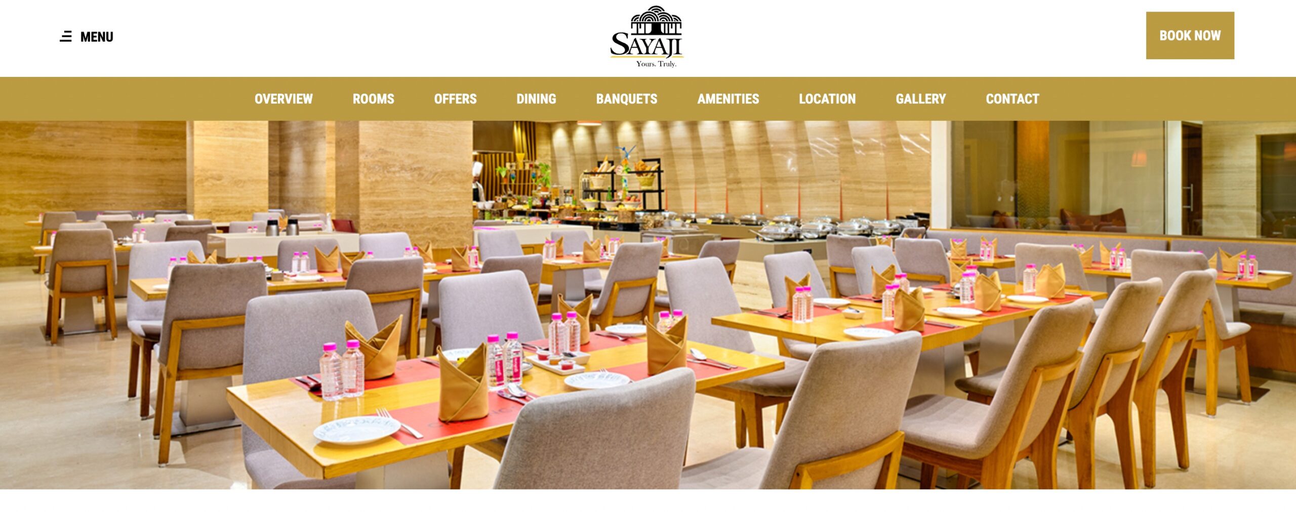
Navigation menus help users move around your site easily. Typically placed at the top or side of the page, they link to important sections like About Us, Services, or Contact.
On a restaurant’s website, the menu might include options like Menu, Reservations, Dining Experience, and Events.
Categories and Subcategories
These groups relate to content to improve discoverability and structure.
For instance, an online store may use broad categories like Clothing, Electronics, and Home Decor, with subcategories such as Men’s, Women’s, and Children’s apparel under Clothing.

3.2 Hierarchy and Organization
The way your website content is structured plays a major role in how users and search engines understand it. Let’s look at three common website structures and how they influence navigation and usability.
Tree Structure
A tree structure organizes content in a branching format, starting from a central homepage and dividing into broad sections that further split into subcategories.
For example, a corporate website can follow this layout:
- Homepage
- About Us
- Products
- Category 1
- Subcategory 1
- Article
- Subcategory 1
- Category 2
- Subcategory 2
- Article
- Subcategory 2
- Category 1
- Blog
- Contact
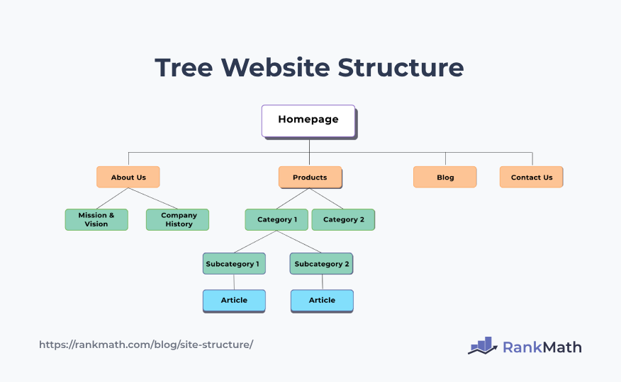
In this example, the homepage serves as the root, branching into sections like About Us and Products, which, in turn, branch into more specific subcategories.
This website structure is ideal for websites with multiple layers of content, as it helps users drill down into specific areas step by step.
Flat Structure
A flat website structure keeps all pages at the same level with minimal or no nesting. It’s straightforward, fast to navigate, and works well for smaller sites with limited content.
For instance, an online portfolio might feature these main sections:
- Home
- About
- Work
- Blog
- Contact
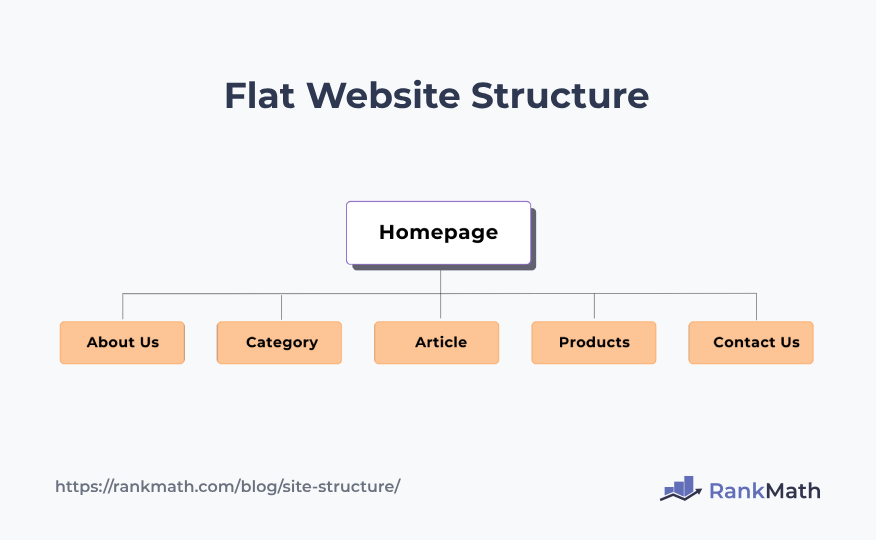
Each section is equally accessible, making it easy for visitors to find what they need quickly.
Silo Structure
A silo structure groups related content into distinct sections or “silos,” with each silo focusing on a specific topic or category. Pages within a silo link to each other but rarely link outside the silo.
Consider a news website:
- Politics
- Domestic Politics
- International Politics
- Business
- Finance
- Markets
- Entertainment
- Movie
- Music
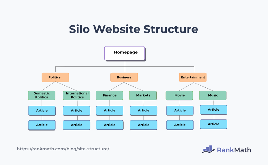
In this scenario, each silo (Politics, Business, Entertainment) is a self-contained unit, and information within each silo is related to its specific topic. This method is especially useful for SEO because it signals clear topical relevance.
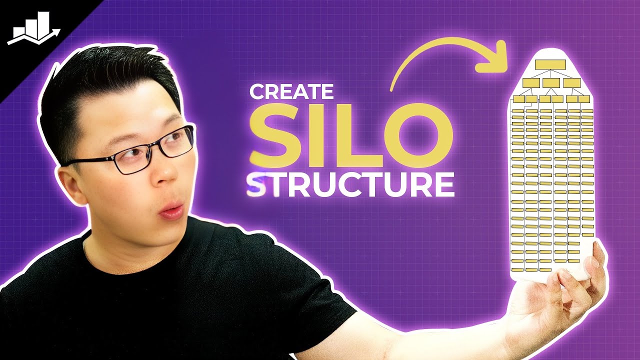
You can refer to our video to create a silo structure for your website.
4 Best Practices to Follow for a Good Website Structure
Now that we’ve covered the key elements of website structure, let’s explore some best practices to help you design a layout that’s both user-friendly and search engine-friendly.
4.1 Homepage Design and Optimization
Your homepage plays an important role in shaping visitors’ first impressions. A well-structured homepage should highlight important content and guide users toward key actions.
Key Content Areas
Feature the most important information in prominent sections of your homepage. This can include banners for current promotions, a Featured Products section, or a New Arrivals showcase. These areas draw attention and help users quickly find what matters most.
For instance, an online store can use a grid layout to display best-selling products right below the fold, making it easy for visitors to start browsing.
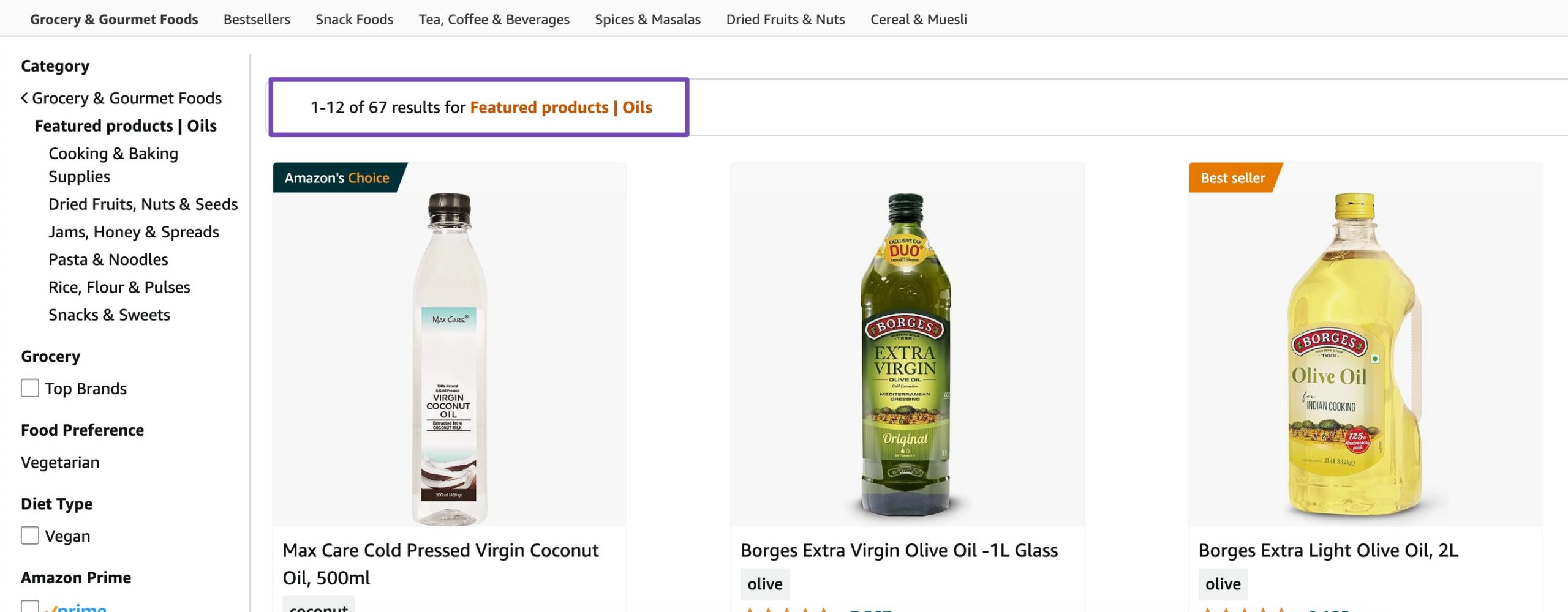
By strategically placing these content areas, your website can create a visually compelling and informative homepage that efficiently communicates the key messages to your audience.
Call-to-Action Placement
Call-to-action (CTA) buttons should be visible and placed where users are most likely to engage. Whether it’s signing up for a newsletter or making a purchase, clear CTAs help guide user behaviour.
On a travel website, for instance, a well-placed button that reads Book Now under a featured destination can encourage immediate action.
4.2 Create a User-Friendly Navigation
Well-designed navigation is a key part of effective website structure. It guides visitors through your site and influences how easily they find what they need. Choosing the right type of menu helps ensure a smooth and intuitive user experience.
However, it’s important to avoid overloading your menu with excessive or irrelevant links, which can appear spammy to both users and search engines. Google may take action against sites that use manipulative or low-quality navigation practices.
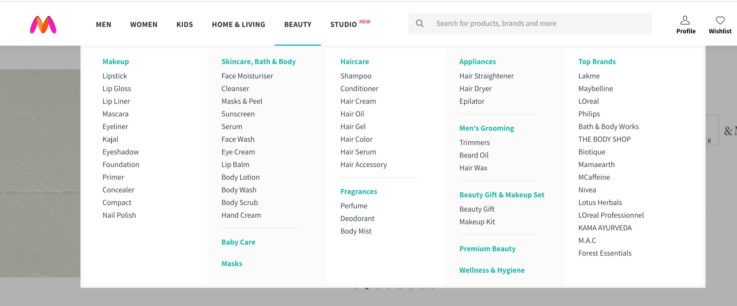
Dropdown Menus
Dropdown menus display a list of options or subcategories when users hover over or click on a main menu item. This design maintains a clean layout while providing quick access to the site’s deeper sections.
For instance, an online store might use a “Beauty” dropdown with subcategories like Skincare, Haircare, and Fragrances.
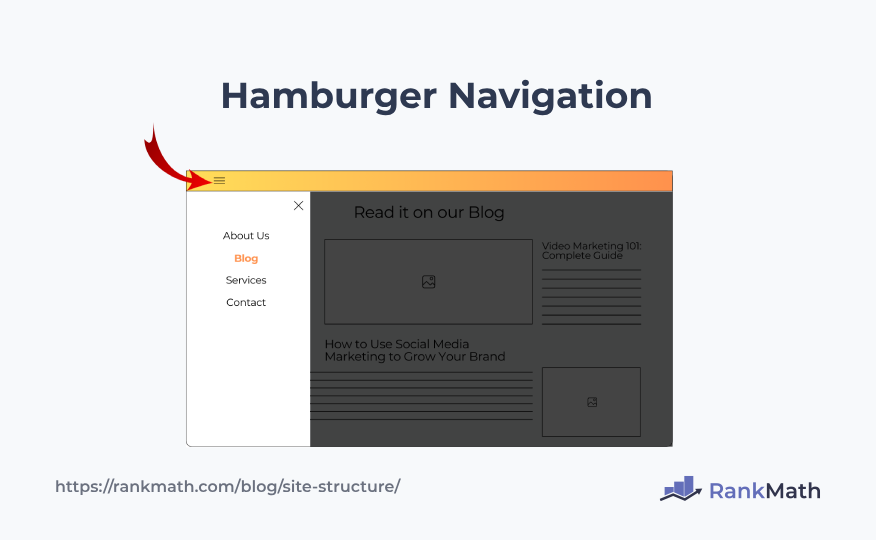
Hamburger Navigation
Often used on mobile and minimalist designs, the hamburger menu is represented by three horizontal lines. It hides the navigation links until the user clicks or taps the icon, revealing a slide-out or drop-down menu.
This approach saves space and reduces visual clutter, especially on smaller screens.
Footer Navigation
The footer navigation provides useful links at the bottom of the page. These menus typically include legal pages (like Privacy Policy or Terms of Service), contact links, or secondary navigation items.
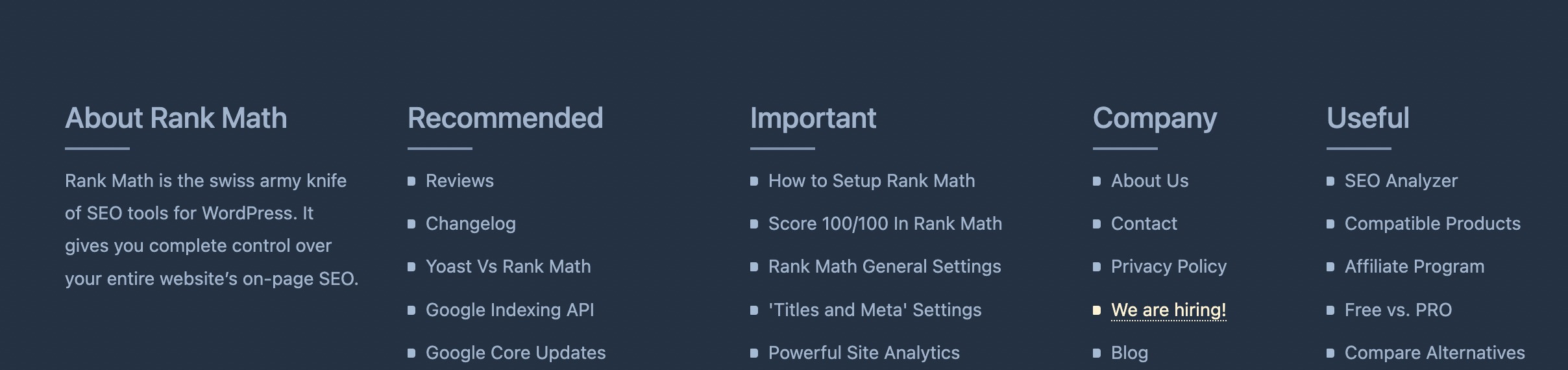
Having a footer menu ensures users can still navigate important areas of your site, no matter where they are on the page.
4.3 Use Internal Links
Internal linking is an essential part of website structure. It helps users discover related content and assists search engines in understanding your site’s layout and content relationships.
Two key strategies to focus on are anchor text optimization and contextual linking for navigation.
Anchor Text Optimization
Anchor text refers to the clickable text in a hyperlink. When optimized correctly, it improves both user experience and SEO by clearly describing what the linked page is about.
Search engines use anchor text to interpret the relevance of linked pages. Descriptive, keyword-rich anchor text offers better context than generic phrases like click here.

This informs your audience about the linked content and signals to search engines that the linked page is likely relevant to the topic of the best smartphones in 2025.
Linking for User Navigation and SEO

Placing internal links within your content helps guide readers to related topics, improving engagement and session duration.
From an SEO standpoint, internal links build a clear site hierarchy, helping search engines crawl and understand how your pages are connected.
For instance, a post about fitness routines might include links to related topics like exercise guides, nutrition plans, or recovery tips. This helps readers explore more while signalling to search engines that your content is well-structured and interconnected.
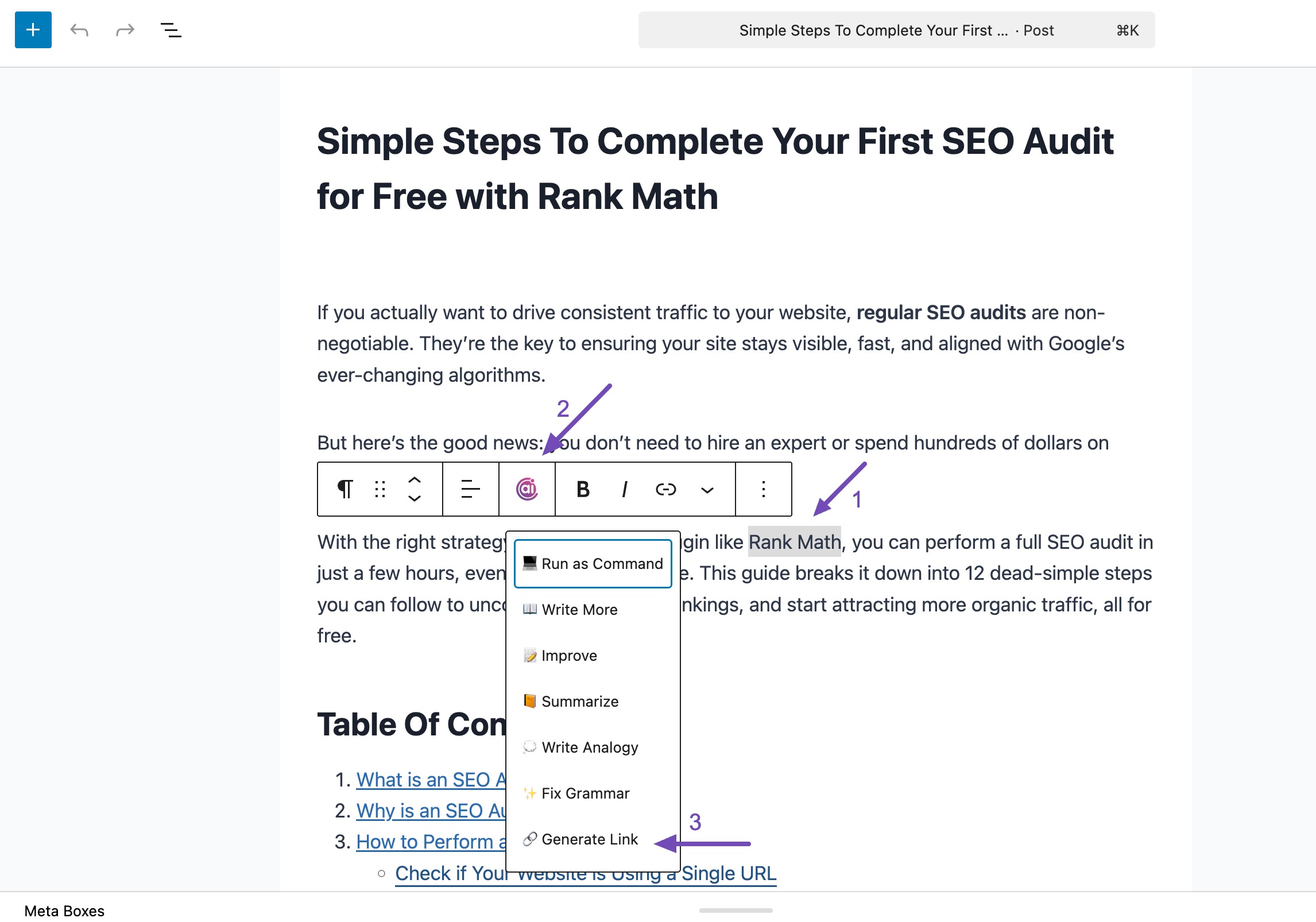
You can use AI Link Genius built inside Rank Math PRO to manage your links with ease. Enable the Link Genius module from WordPress Dashboard → Rank Math SEO, then open any post to start adding internal links.
To insert links while writing, simply highlight text, click the Content AI icon, and choose Generate Link. Select a suggested link, and it will be added instantly.
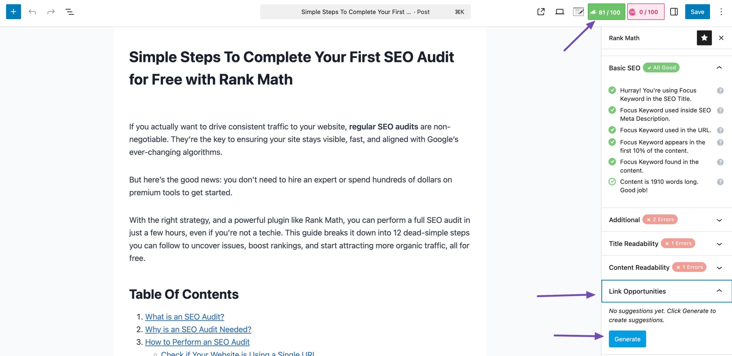
You can also use Link Opportunities from the Rank Math panel to generate and insert relevant internal links with one click.
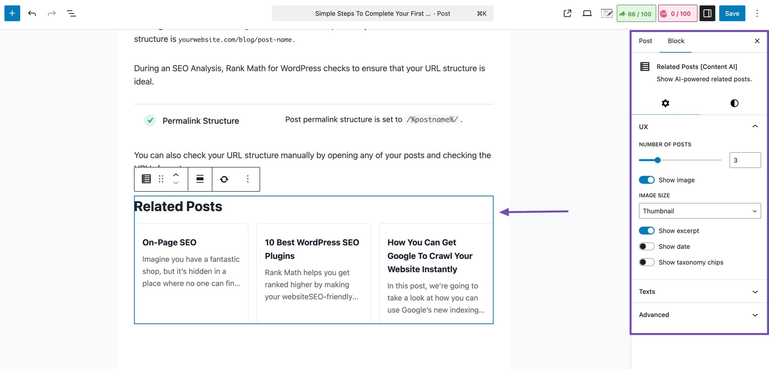
Additionally, use the Related Posts option to automatically add a block of internal links to your post. You can adjust the number of posts displayed and choose whether to show images in the block settings.
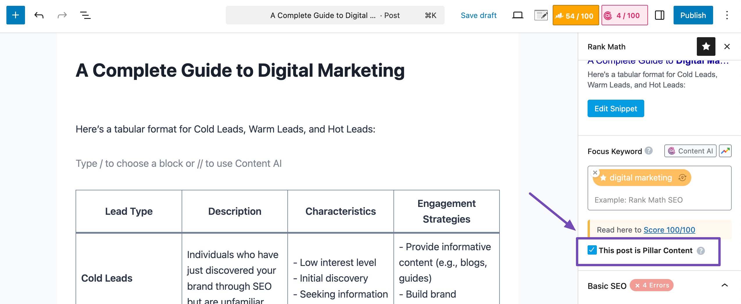
You can also support this strategy by creating pillar content, comprehensive pages that serve as hubs linking to related subtopics.
To mark a post as pillar content in Rank Math, edit the post, navigate to the General tab in the Rank Math SEO settings, and check the box labelled This post is Pillar Content, as shown below.
Refer to our dedicated article on link-building to build links for your website strategically.
4.4 Use Comprehensive SEO Strategies
Building SEO strategies is important for optimizing a website’s visibility on search engines. This involves various strategies to enhance search engine crawling, including optimising URL structure and using breadcrumbs. Let’s discuss them in detail.
Search Engine Crawling
Two essential components for effective search engine crawling are sitemaps and robots.txt.
XML Sitemaps
XML sitemaps serve as a roadmap for search engines, providing a structured list of URLs within a website. They help in efficient crawling and indexing.
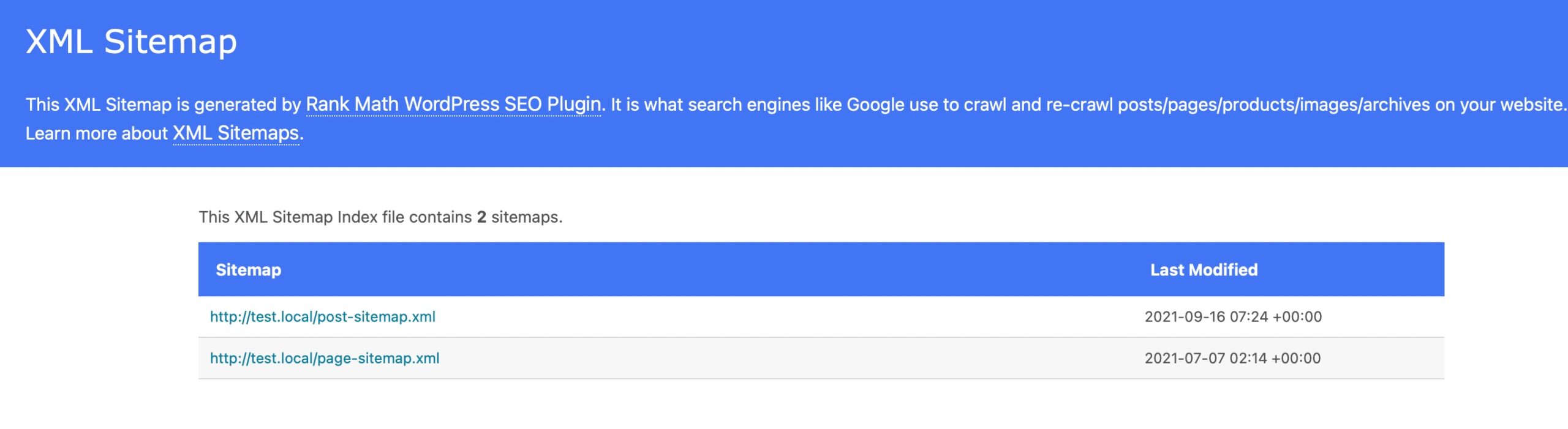
With Rank Math, you can generate search engine compatible sitemaps and automatically notify the search engines of updates.
Refer to our dedicated tutorial on configuring sitemaps in Rank Math and leverage the benefits of sitemaps with our plugin.
Robots.txt Optimization
Robots.txt is a text file that provides instructions to search engine crawlers about which pages or sections of a website should not be crawled or indexed.
Rank Math makes it possible to edit your robots.txt file right inside your WordPress dashboard. TO do so, navigate to Rank Math SEO → General Settings from your WordPress dashboard. Click Edit robots.txt.
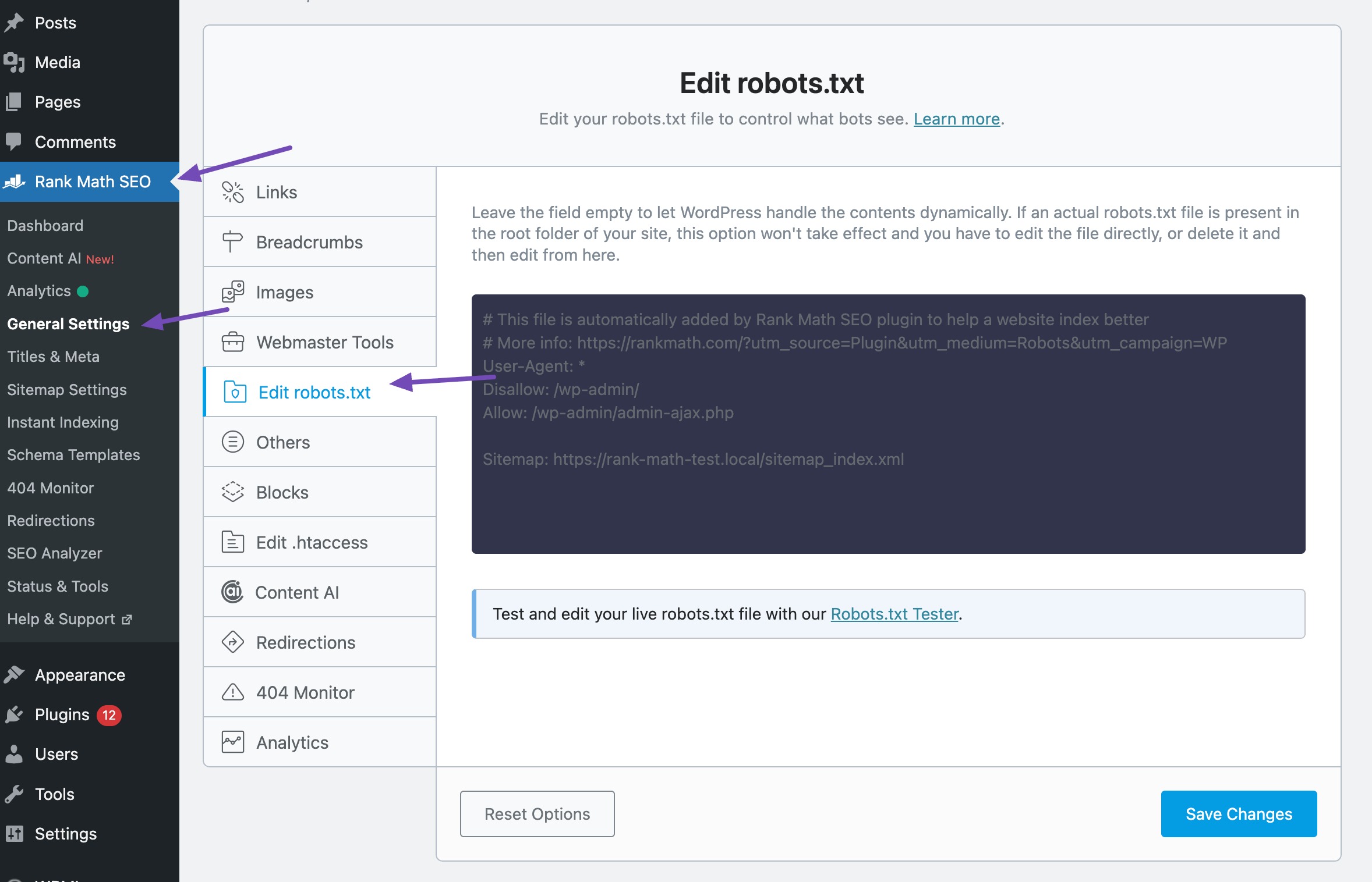
Optimizing the robots.txt file is necessary to focus search engine attention on valuable content and avoid indexing non-essential or sensitive pages.
For instance, excluding pages like “admin” or “thank-you” pages from crawling ensures that search engine bots prioritize the visibility of relevant content to users.
Optimize URL Structure
The URLs should be simple and easy to understand, as search engines utilize them to understand the hierarchy and website structure.
For instance, a fitness blog can optimize its URL structure with “website.com/fitness-blog,” providing clear indications of content focus.
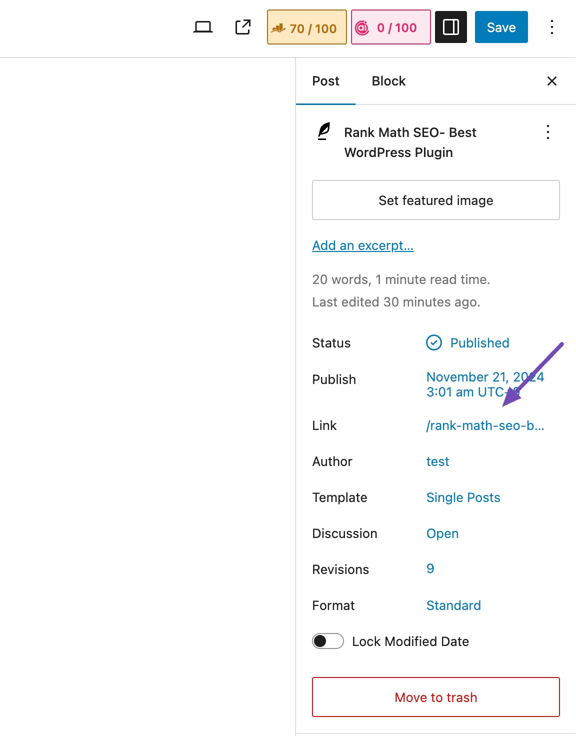
Here’s how the URL appears on your WordPress post/pages.
Hyphens are effective word separators, promoting search engine friendliness, as seen in “website.com/healthy-living-tips.”
Avoid keyword stuffing and maintain a balanced approach for focused and relevant URLs, such as “website.com/effective-digital-marketing-strategies.”
Use Breadcrumbs
Breadcrumbs provide users with a clear trail of where they are on your site and make it easier to navigate back to previous sections. They also help search engines better understand the content hierarchy.
For instance, a breadcrumb trail like Home > Footwear > Sports Shoes > Men’s Sport Shoes indicates the audience’s journey through the site’s structure.

Rank Math SEO plugin adds the Breadcrumb Schema that search engines require to show breadcrumbs in search results easily.
Refer to our Technical SEO guide and unlock the secrets to search engine rankings and improve user experience.
4.5 Responsive Design and Mobile Optimization
Responsive layout ensures your website looks and works well on all devices—whether it’s a desktop, tablet, or smartphone.
By using flexible grids and scalable elements, your content adjusts automatically to fit different screen sizes.
For example, images might scale down, and text blocks may stack vertically on smaller screens, improving readability and maintaining a smooth user experience across devices.
5 Frequently Asked Questions
How many levels deep should a site be?
Ideally, important content should be no more than two or three clicks away from the homepage, making it easier for visitors and crawlers to reach deeper pages.
What mistakes should be avoided in site structure?
Common mistakes include overly flat structures with hundreds of unorganized pages, orphan pages with no internal links, deep content buried many clicks down, and complex navigation that confuses users.
How does site structure support content strategy?
A strong structure reveals logical topic groupings, helps plan content clusters, and enhances how search engines interpret relationships between related content.
6 Conclusion
A well-structured website lays the foundation for better usability, stronger SEO, and a more satisfying visitor experience. From clear navigation and smart internal linking to mobile-friendly design, every element plays a role in helping users find what they need quickly and easily.
By applying these best practices, you create a website that not only draws visitors in but also encourages them to stay, explore, and return.
If you like this post, let us know by Tweeting @rankmathseo.