What is a Viewport?
The viewport is the visible area of a webpage. They control how the content on a webpage is laid out and displayed to the visitor. Viewports are smaller on mobile devices and can increase or decrease depending on the resolution of the viewing device.
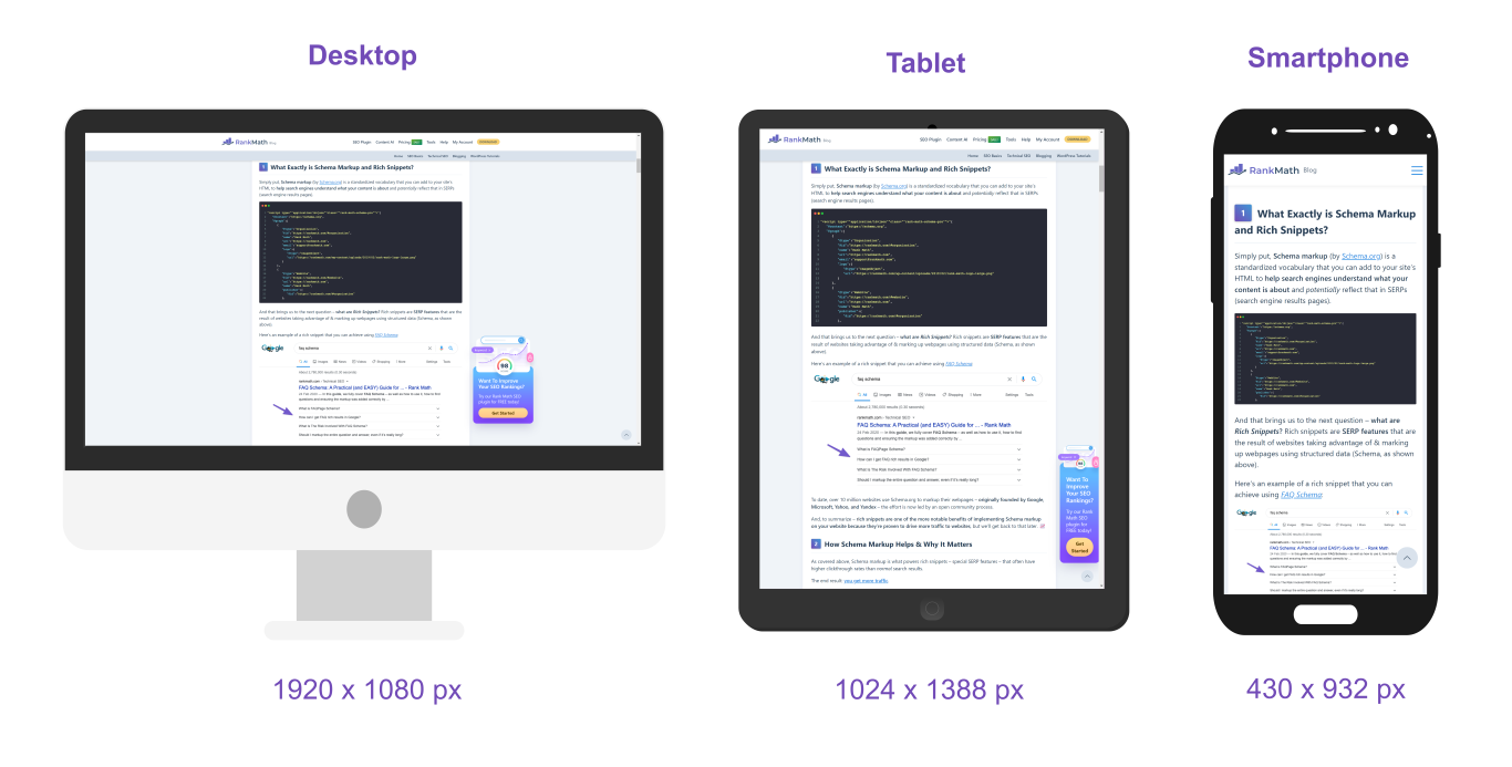
The below image shows the viewport of the same webpage on different devices. Notice how you can view more content as the length of the viewport increases. The format of the webpage also changes depending on the viewport’s width. The wider the viewport, the more content is displayed across the page.
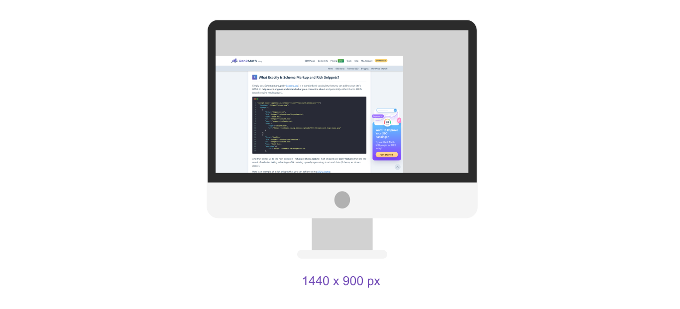
 Irrespective of the resolution of the viewing device, the viewport changes when the user resizes the browser window. For example, the image below shows that the viewport reduces when the browser size is reduced.
 The viewport is a crucial component of responsive design. It allows bloggers to serve the same webpage to everyone, irrespective of their device.
Why the Viewport is Important
Webpages had a specified width back when most visitors accessed the web using desktops. This worked fine since desktops all looked alike, so the content was usually displayed the same way regardless of the desktop used.
However, that changed once mobile devices came along. Mobile devices have smaller widths compared to desktops. So, it became problematic to display content within the available viewport.
Mobile visitors either had to scroll sideways or make do with the webpage being compressed into the smaller viewport of the mobile device, which resulted in the content being displayed in ridiculously small fonts that made it unreadable in many cases.
Both options led to a poor user experience as many sites became difficult and almost impossible to use, especially on mobile devices.
Many sites initially responded to this by creating specialized sites for mobile users. These sites usually began with m. just like m.example.com. However, this came with usability issues since many visitors still ended up on the desktop sites. It also left bloggers maintaining two sites since the mobile and desktop versions of the site were managed differently.
This led to the rise of responsive design, wherein bloggers create one site that caters to mobile and desktop users. The viewport is set using the viewport meta tag in HTML, which specifies how the page should scale and display on different devices.
<meta name="viewport" content="width=device-width, initial-scale=1" />
Web designers also use media queries in CSS to adapt the page layout to different viewport sizes. For example, the CSS code below specifies the font size and margins depending on the viewports.
/* Default styles for large screens */
body {
  font-size: 18px;
  margin: 20px;
}

/* Styles for viewports smaller than 768px (e.g., tablets) */
@media (max-width: 768px) {
  body {
    font-size: 16px;
    margin: 15px;
    }
  }

/* Styles for viewports smaller than 480px (e.g., smartphones) */
@media (max-width: 480px) {
  body {
    font-size: 14px;
    margin: 10px;
    }
  }
Viewport Best Practices
Viewports can severely affect the usability and user experience of a webpage. To ensure visitors have a seamless experience when using your site, it is good practice to avoid setting a fixed width and following the best practices listed below.
1 Use the <meta name=viewport> Tag to Set the Viewport Dimensions
The HTML <meta name=viewport> tag is essential for controlling how a webpage fits into different screen sizes. The meta tag specifies the viewport’s width, height, and initial zoom level and is included in the HTML document’s <head>.
2 Set the width=device-width to Ensure Proper Scaling
The HTML width=device-width attribute instructs the browser to match the width of the viewport to the width of the device. It is included in the HTML viewport meta tag and is set to one. This ensures that the webpage is displayed at an optimal size. Without it, mobile visitors may need to scroll sideways.
3 Use initial-scale=1 to Set the Default Zoom Level
The HTML initial-scale=1 attribute defines the zoom of the page the moment it loads. This prevents browsers from automatically zooming in or out, which may lead to inconsistencies in how content is rendered. It is set to 1, so visitors do not need to zoom in to access the webpage’s content.
4 Use Responsive Media That Adapt to Different Screen Sizes
Responsive images and media automatically adjust their size and resolution depending on the visitor’s device. This ensures optimal visual quality and reduces page speed. It can be set using HTML attributes like srcset or CSS properties like max-width: 100%.