Optimizing your website for mobile devices isn’t optional anymore, it’s a must. Think about this: if your site takes more than three seconds to load on a phone, over half of your visitors will leave. That’s a lot of missed opportunities.
Mobile SEO is all about making sure your site not only looks good on smartphones and tablets but also loads fast, functions smoothly, and keeps people engaged. And yes, it goes way beyond just having a responsive design.
Ask yourself: Does your page load in a blink? Can visitors easily read and interact with your content on a small screen? If not, you’re losing valuable traffic.
In this post, I’ll walk you through the key strategies you can use to master mobile SEO and give your visitors the experience they expect. So, let’s dive in and get started.
Table Of Contents
1 What is Mobile SEO?
Mobile SEO is the process of optimizing your website so it performs at its best when an audience visits from a smartphone or tablet. In simple terms, it’s about making sure your site loads quickly, looks great, and works smoothly on smaller screens.
When I say mobile SEO, I’m talking about more than just making your site responsive. It’s about creating an experience where your audience can easily read, click, and navigate, without zooming in, pinching the screen, or waiting forever for a page to load.
For this, you must think about:
- Speed – Your site should load in seconds, even on slower mobile networks.
- Layout – Buttons, menus, and text should be easy to tap and read without frustration.
- Content formatting – Shorter paragraphs, clear headings, and mobile-friendly images keep visitors engaged.
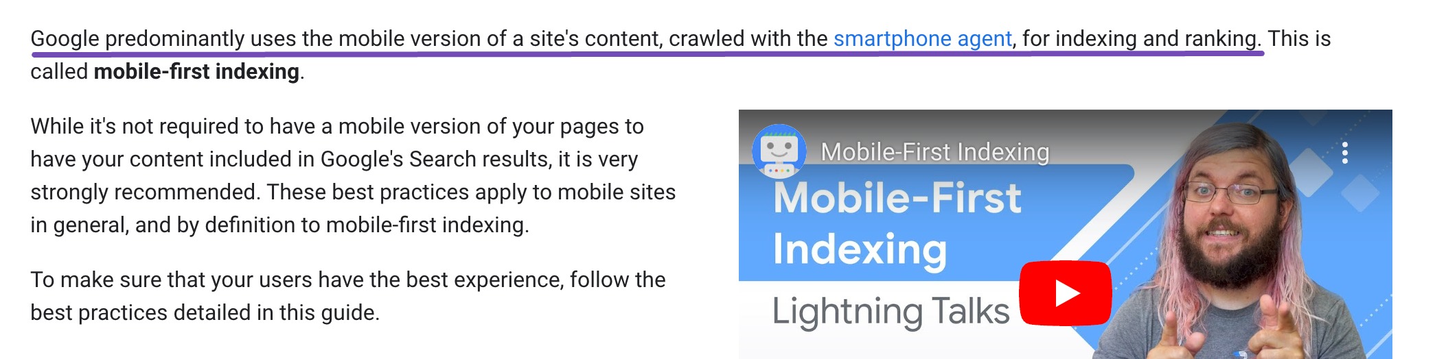
- Search visibility – Google uses mobile-first indexing, meaning it primarily looks at your mobile site to decide rankings.
If your mobile experience is slow or clunky, your visitors will leave, and your rankings can take a hit. But when you get mobile SEO right, you keep your audience browsing longer, improve conversions, and build trust with your audience.
2 The Importance of Mobile SEO
We live in a mobile-first world. More than half of all global web traffic comes from mobile devices, which means your audience is more likely to visit your site from a phone than a desktop. If your website isn’t optimized for mobile, you’re leaving opportunities and money on the table.
If your site loads slowly, is hard to navigate, or doesn’t display properly, visitors will leave. And when they leave, your bounce rate goes up and your conversions go down.
Google has made mobile optimization even more important with mobile-first indexing. This means Google primarily looks at your mobile site when deciding how you rank. If your mobile version is weak, your visibility and organic traffic can take a serious hit, no matter how polished your desktop site is.
3 Best Practices for Mobile SEO
Let us now discuss the best practices for mobile SEO.
3.1 Create Mobile-Friendly Content
If you want your visitors to stick around, your content needs to work perfectly on a small screen. Mobile users have less space to view your content and less patience to hunt for what they need, so you have to make every word count.
The key is to make your content scannable. Use short paragraphs (2–3 sentences each), clear and descriptive headings, and bullet points to highlight the most important details. This way, your readers can quickly find the information they’re looking for without scrolling through endless walls of text.

Lists and bullet points work especially well for summarizing key takeaways, making them easy to digest and remember.
When you present your content in a mobile-friendly format, you not only improve readability but also keep people engaged longer, which can boost both your rankings and your conversions.
For instance, an article on a mobile site should break its content into bite-sized paragraphs of 2-3 sentences each, with descriptive headings that help the audience quickly identify relevant sections.
3.2 Use Structured Data on Mobile Devices
Structured data is a standardized format using Schema markup, providing search engines additional context about what a page’s content represents.
By adding Schema markup to your pages, you give search engines extra context about your content, whether it’s a product, a recipe, an event, or a review.
The payoff? Your content becomes eligible for rich snippets, enhanced search results that show extra details like ratings, images, or step-by-step instructions right on the results page. This is especially valuable for mobile users, who want quick answers without having to click through and wait for a page to load.
These rich snippets are especially important for mobile audiences, as they provide quick access to relevant information without requiring users to click through to the site.
For example, a recipe blog using Schema markup can feature its recipe in a rich snippet with an image, ratings, and step-by-step instructions. This enhances visibility and improves click-through rates (CTR) on mobile, where audiences seek fast and direct answers.

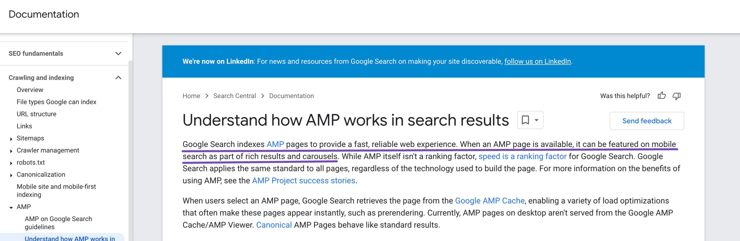
You can also take mobile performance a step further with Accelerated Mobile Pages (AMP). AMP is a framework that strips pages down to their essential elements so they load almost instantly on mobile devices. If you run a news site, for instance, AMP can help your articles reach readers faster, keeping them engaged and reducing bounce rates.
3.3 A Responsive Web Design
If you want your website to look great and work flawlessly on any device, desktop, tablet, or smartphone, you need a responsive web design. Instead of building separate versions for different devices, responsive design automatically adjusts your layout, images, and navigation to fit any screen size.
This means no more pinching to zoom, no awkward horizontal scrolling, and no misaligned text or images. You’re giving your visitors an effortless browsing experience from the moment they land on your site.
Responsive design also helps your mobile SEO. With a single URL for both desktop and mobile, all your traffic and backlinks point to the same address. This makes it easier for Google to index your pages and can boost your search rankings.
Here’s a quick example: imagine a news site shows a multi-column layout on a desktop. On a smartphone, that same layout automatically shifts to a single column, stacking articles vertically. Images resize perfectly, and the navigation menu becomes a simple hamburger icon. The result? The readers can focus on the content without frustration, and they’re more likely to stick around.

3.4 Target Voice-Search Friendly Keywords
With voice assistants like Siri, Google Assistant, and Alexa becoming part of everyday life, optimizing for voice search is now a key part of mobile SEO. If you’re not thinking about how audiences speak their searches, you can be missing out on valuable traffic.
Voice searches are different from typed searches; they’re longer, more conversational, and often phrased as full questions. For example, instead of typing best pizza places, someone might ask, What are the best pizza places near me?

Here’s how you can optimize for voice search:
- Use natural language – Write your content the way people talk. Keep your tone conversational and answer common questions directly.
- Focus on long-tail, question-based keywords – Think about who, what, where, when, how, and why. For example, instead of targeting car oil change, try How can I tell if my car needs an oil change?
- Optimize for local SEO – Many voice searches are location-based. Make sure your business details are accurate and visible so you show up for questions like Where is the nearest coffee shop?
When you target voice-search-friendly keywords, you’re aligning your content with how the audience searches, especially on mobile. This can help you capture more local traffic, boost your visibility, and meet your audience exactly where they are: on the go, asking questions out loud.
Refer to our dedicated tutorial on voice search optimization to gain valuable mobile traffic and improve your visibility in voice search results.
3.5 Optimize Mobile Site Speed
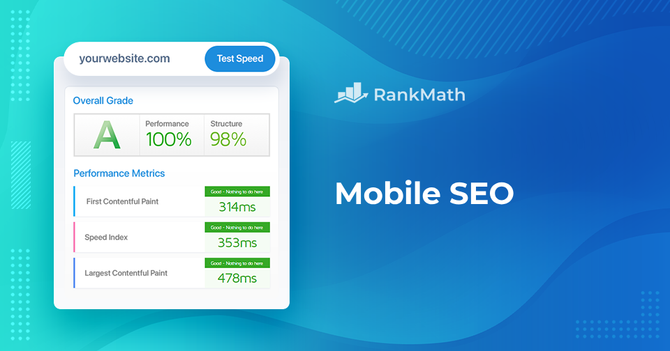
When it comes to mobile SEO, speed isn’t just nice to have; it’s essential. Your visitors are often on the go, and if your site takes more than a few seconds to load, they’ll leave. Google knows this, which is why page speed (especially Core Web Vitals) is a key ranking factor.
A fast site keeps people engaged, reduces bounce rates, and can give you an edge in search results.
The good news? You can easily find out how your site performs with Google’s free PageSpeed Insights tool.
Enter the URL of the webpage you want to test and click Analyze.
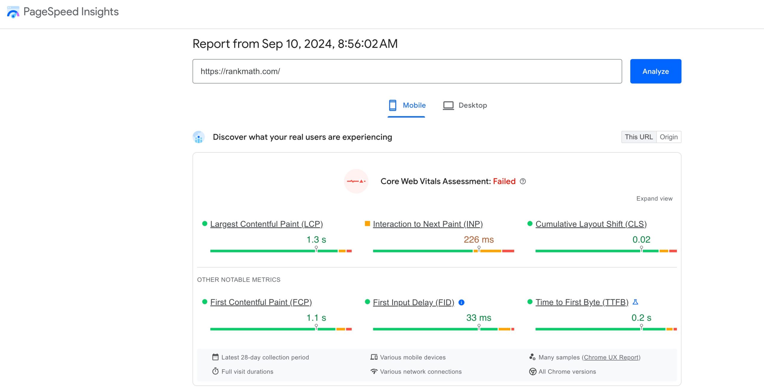
The tool will highlight opportunities and diagnostics to improve your mobile site speed. Review them and make the necessary changes to optimize your mobile site speed.
3.6 Optimize Title Tags & Meta Descriptions for Mobile SERPs
Your title tag and meta description are often the first things audiences see in search results, and on mobile, space is limited. If they’re too long or unclear, your message gets cut off, and you can lose clicks.
For mobile-friendly titles, aim for 50–60 characters. This keeps the full title visible on small screens and ensures your audience gets the complete message. Make sure your title clearly describes what the page is about and is compelling enough to grab attention.
For meta descriptions, keep them around 120 characters. Use this space to quickly tell visitors what they’ll get from your page, answer a question, offer a solution, or highlight your value in one concise sentence.
If writing titles and descriptions feels tricky, our Content AI can help you create short, click-worthy options that fit perfectly in mobile search results.

3.7 Monitor Mobile Performance
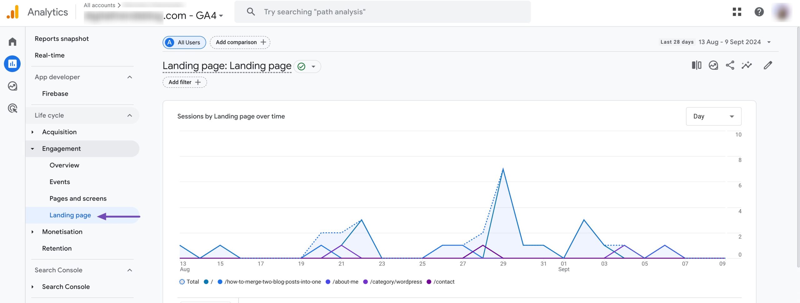
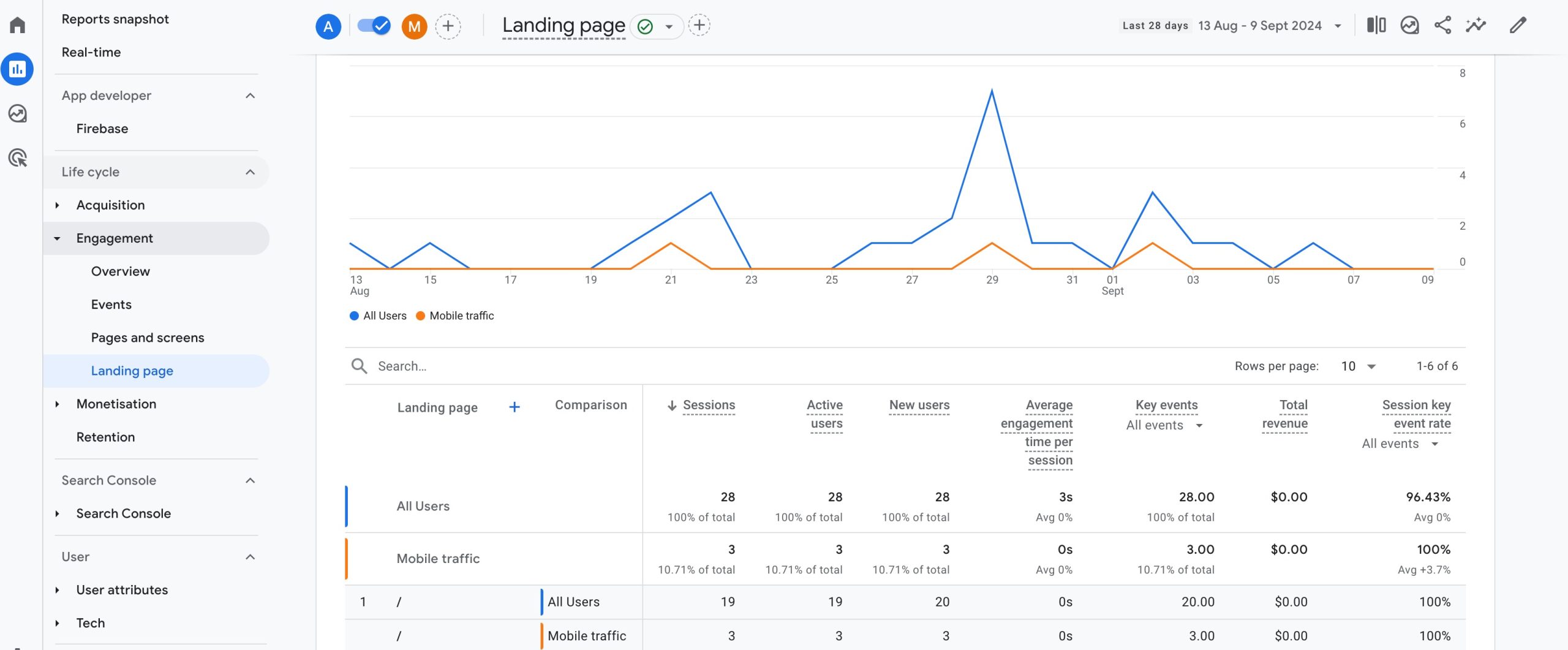
Google Analytics 4 is a powerful tool for tracking mobile traffic, bounce rate, mobile conversions, and other important performance metrics.
Start by logging into your Google Analytics account. Navigate to Behavior → Site Content → Landing page on the left-hand navigation bar, as shown below.
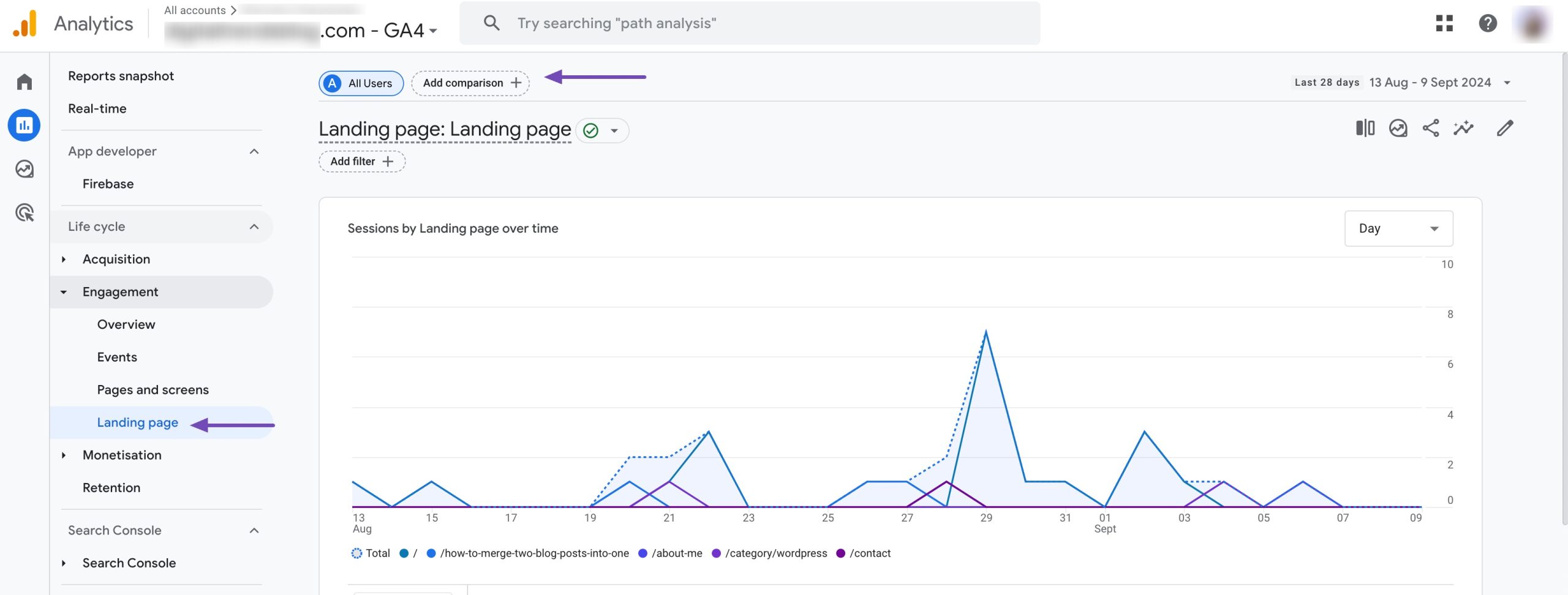
To include mobile information for each page, click on Add comparison at the top of the page.
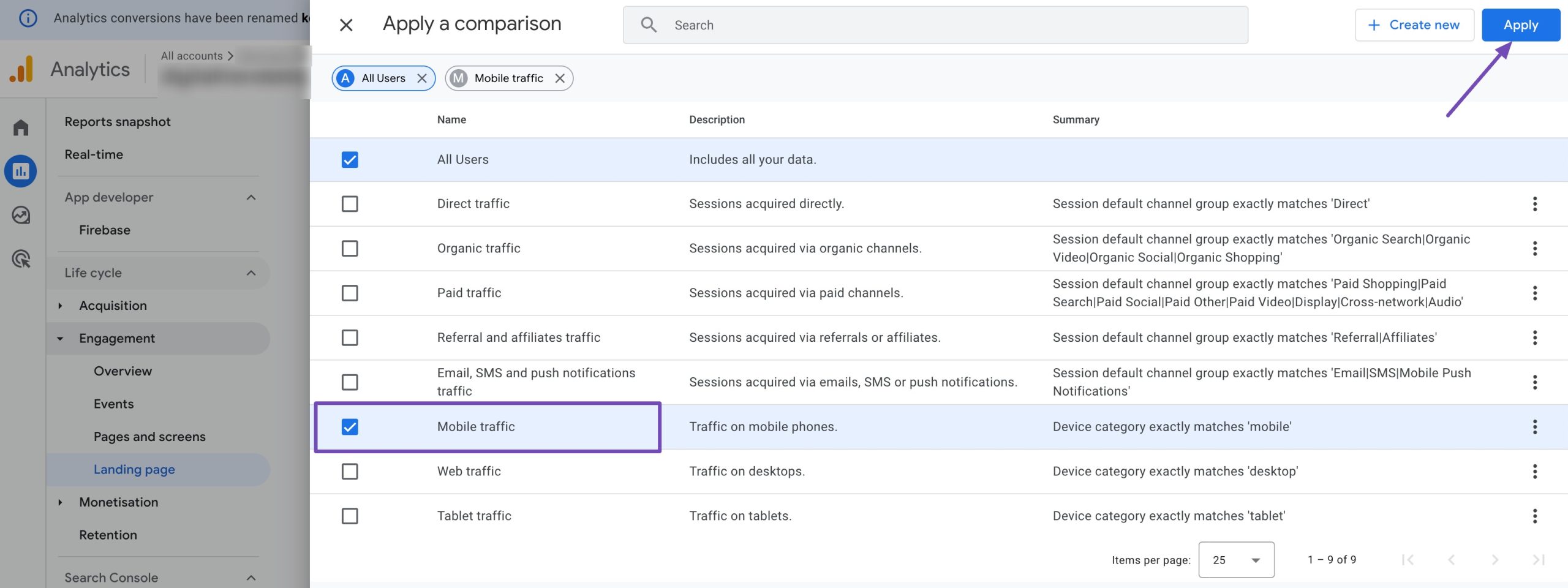
Select the Mobile traffic from the available options and click the Apply button.
You’ll now be able to see the mobile traffic, which will help you identify issues like high bounce rates or low conversion rates on mobile devices.
4 How to Check and Improve Mobile-Friendliness
Ensuring your website is mobile-friendly is essential for SEO. Here are two practical ways to check your site’s responsiveness and mobile usability.
4.1 Using Chrome Developer Tools
Google Chrome’s built-in Developer Tools allow you to test how your site appears and functions on different devices.
Open Chrome and visit your website. Right-click anywhere on the page and select Inspect (or press Ctrl + Shift + I on Windows / Cmd + Option + I on Mac).
Click on the Toggle Device Toolbar icon (or press Ctrl + Shift + M).
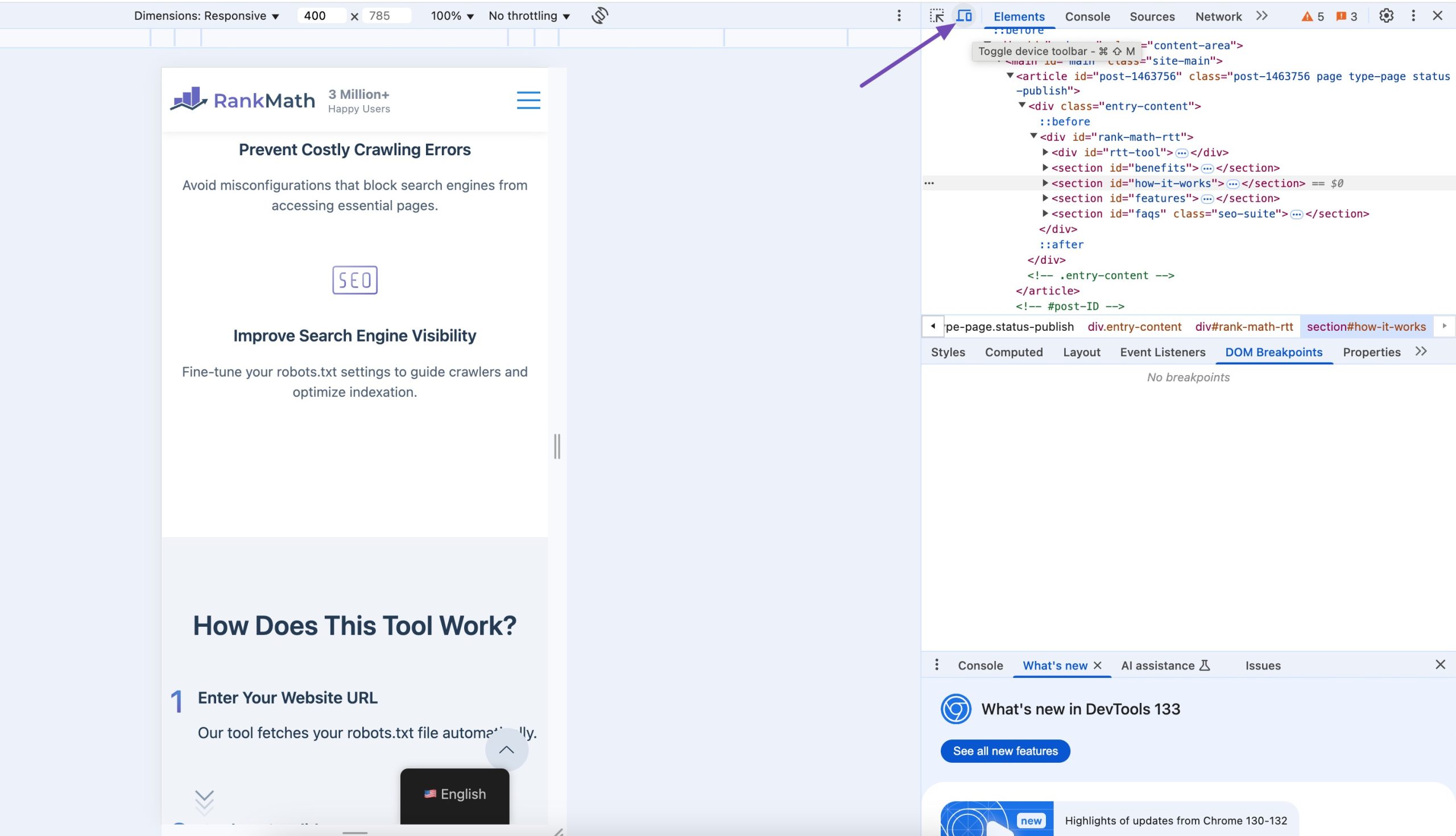
From the top dropdown menu, choose devices like iPhone, Pixel, or Samsung Galaxy.
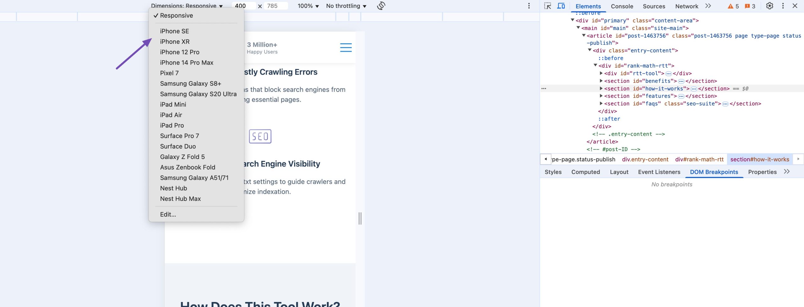
Now you can spot layout issues, text that’s too small, or buttons that are hard to tap. When you find something off, tweak your CSS or design to fix it before your visitors notice it.
4.2 Testing with Bing’s Mobile Friendliness Tool
While Google’s Mobile-Friendly Test is widely used, Bing offers its own Mobile-Friendliness Test that provides additional insights:
Visit Bing Mobile Friendliness Test. Enter your website’s URL and click ANALYZE.
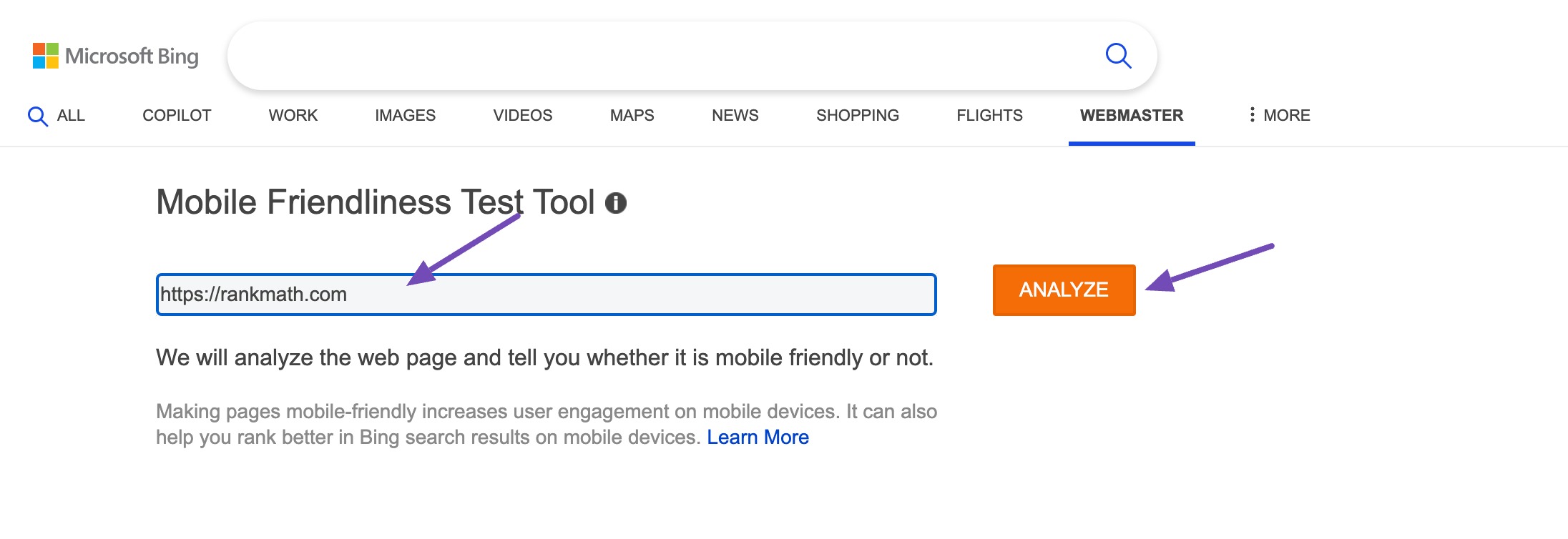
Review the results, which include issues like small font sizes, touch elements too close together, and viewport configuration problems.
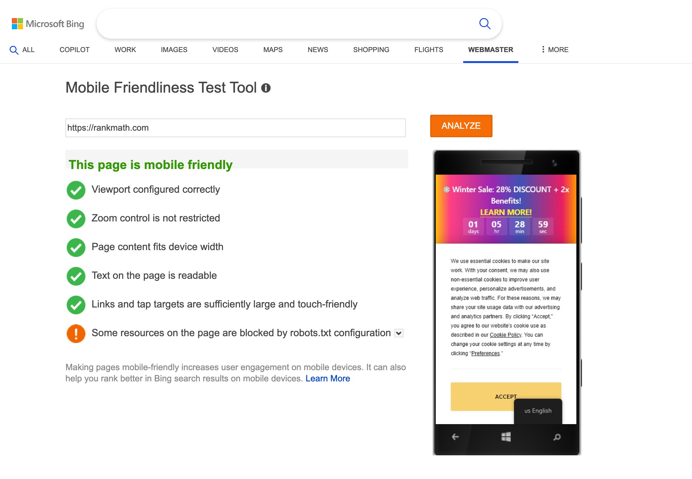
Implement the recommended fixes to improve usability on mobile devices.
Regularly testing and optimizing your site’s mobile-friendliness can ensure a better user experience and maintain strong search rankings.
5 Frequently Asked Questions
Should I optimize content differently for mobile users?
Yes, mobile readers often skim, so use short paragraphs, clear headings, bullet lists, and easily clickable links to make your content easier to consume on smaller screens.
How do pop-ups affect mobile SEO?
Intrusive pop-ups on mobile can frustrate users and harm rankings. If you use pop-ups, make sure they’re easy to close and don’t block the main content.
Does site architecture matter for mobile SEO?
Yes, a clean, logical structure with clear navigation helps mobile crawlers index your pages more easily and improves user experience.
How can I improve mobile page speed?
Optimize images, reduce JavaScript and CSS bloat, enable lazy loading, use browser caching, and choose a fast hosting provider.
6 Conclusion
Making sure your website works well on mobile devices is no longer optional. If your site is easy to use on a phone, visitors can find what they need quickly and without frustration.
This not only helps users stay longer but also improves your chances of showing up higher in search results.
By regularly checking and improving your site’s mobile experience, you make it easier for your audience to visit, read, and take action, no matter what device they use.
If you like this post, let us know by tweeting @rankmathseo.