What is Below the Fold?
Sous le pli fait référence à la zone d'une page Web qui devient visible uniquement lorsque le visiteur fait défiler la page. In other words, it is the part of the page that the visitor must scroll to see.
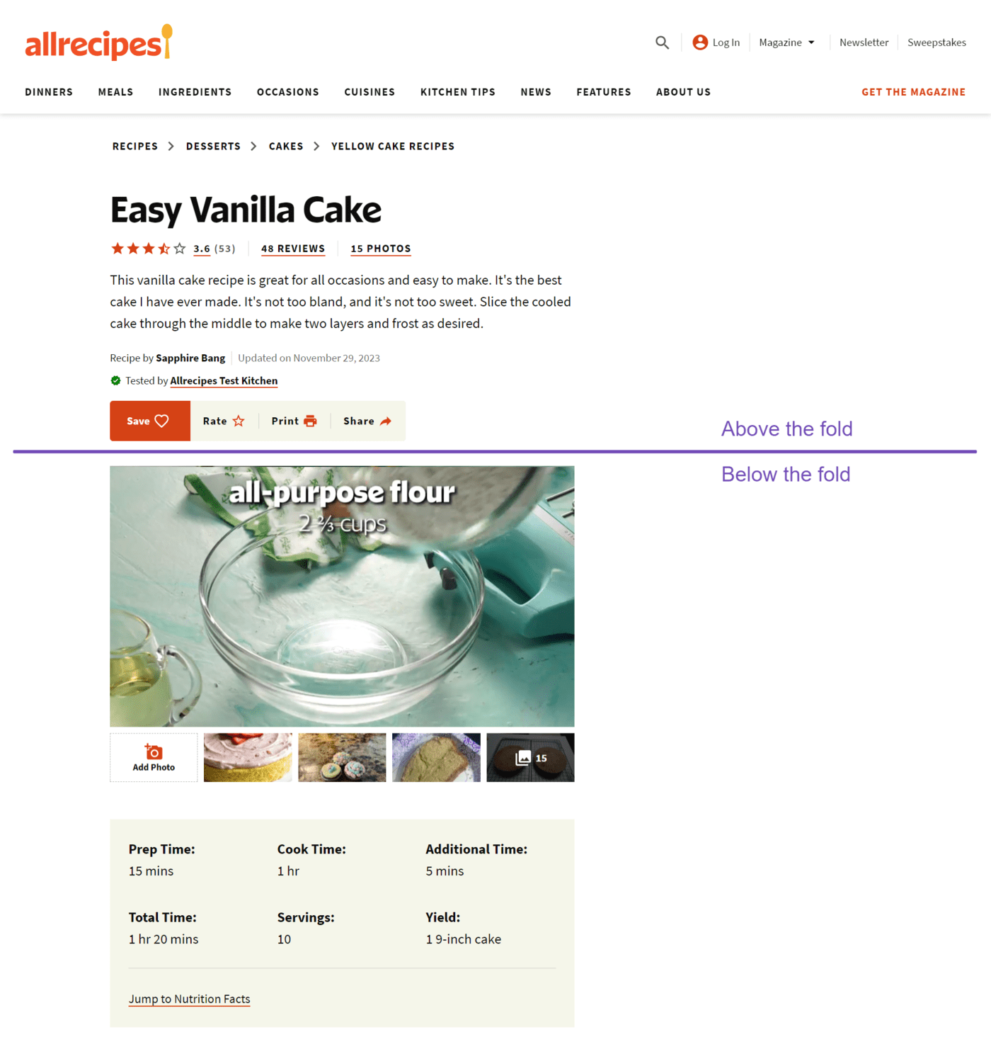
The below the fold contrasts with au-dessus du pli, which refers to the part the visitor can view without scrolling. The image below shows the above and below the fold areas of a webpage.

It is necessary to note that the area considered above or below the fold is not fixed. The zoom settings on the browser and viewport of the viewing device will ultimately determine which content falls above or below the fold.
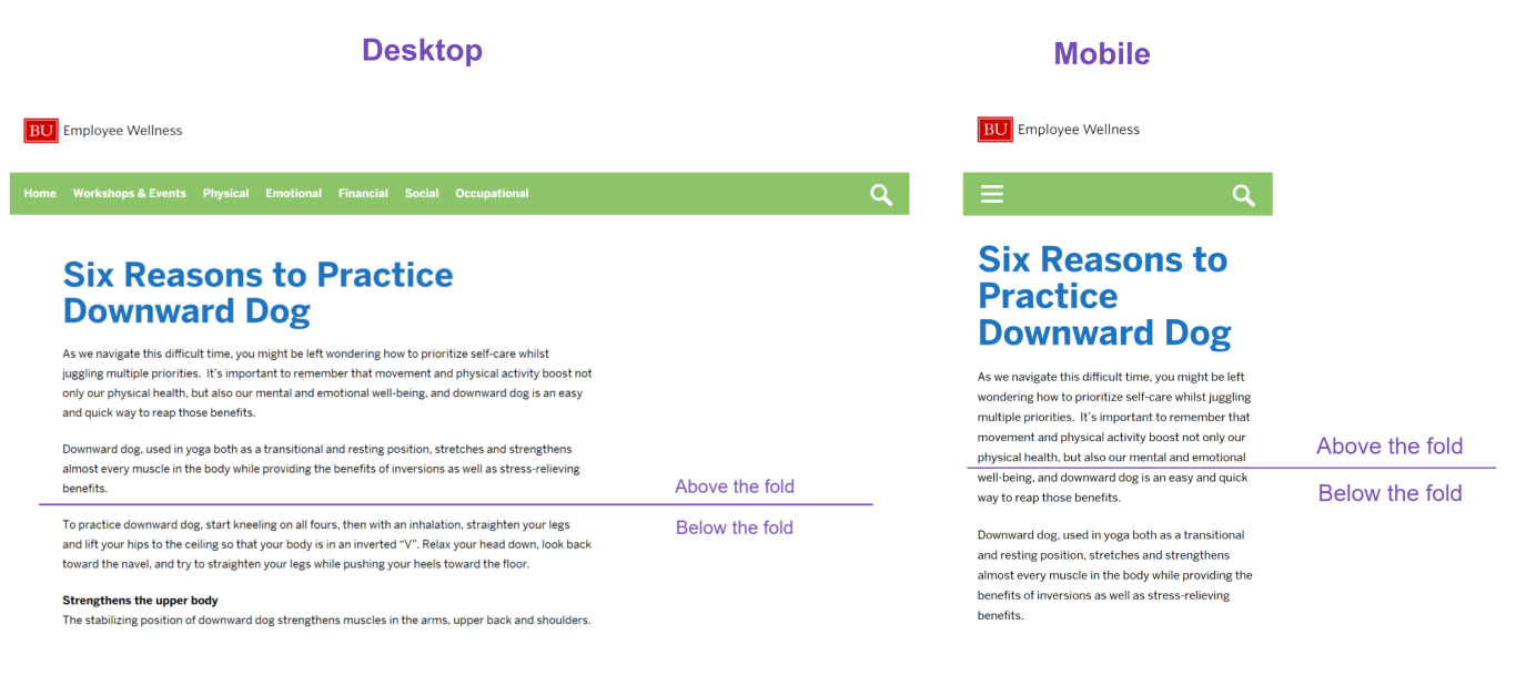
For example, this is the area above and below the fold on the same webpage when viewed using a desktop browser and mobile device at 100% zoom.

As a rule, desktops allow more content above the fold compared to mobile devices. Zooming out allows more content to be displayed above the fold, while zooming in allows less content to be displayed.
Origin of Below the Fold
The term ‘below the fold’ originates from the early days of news publishing when newspapers were folded in half for display on newsstands. The upper half, which was visible to customers, was called above the fold, while the lower half, which was not visible, was called below the fold.
The area below the fold usually contains less important news and headlines than the one above the fold. However, the content was still captivating enough to encourage visitors who read the area above the fold to purchase the newspaper.
Why the Below the Fold is Important
The area below the fold receives less views than the one above the fold. So, the ads and content there are less visible than what is above the fold. However, they are helpful for visitors that need additional information about a webpage.
While the above the fold section should attract visitors to the webpage, the below the fold should contain additional information that keeps them on the webpage. If the above the fold is good, and the below the fold field is not, then visitors will leave the webpage, increasing its taux de rebond.
In all, the below the fold area should contain content that satisfies the search intent and keeps visitors on the site.
Below the Fold Examples
The specific content in the below the fold area differs from site to site. The content displayed there depends on the intent of the site. For example, this shows the above and below the fold areas of an image compression software site.
The below the fold section contains headlines, subheadings, and content that informs visitors about the credibility of the product and assures them that it will improve their images. It also includes multiple calls to action that encourage visitors to use the software.
This contrasts with the above the fold section that contains a headline, subheading, hero image, and call to action buttons encouraging the visitor to use the software.
Below the Fold Best Practices
The content below the fold should complement what is above the fold. While the specifics may vary, depending on the intent of the webpage, here are a few ways to improve and get the most out of it.
1 Include Multiple CTAs Below the Fold
Many visitors take their time to read the content below the fold. So, it is good practice to include call to actions there so that they can click on it whenever they are ready to convert. There should be multiple calls to action, depending on the length of the webpage, so that visitors can convert at any point.
2 Include Concise and Engaging Subheadings
Subheadings help to break content and guide users through the page smoothly. These subheadings entice users to keep scrolling and explore more of the content. They also improve readability, making it easier for users to find information that interests them.
3 Include a Visually Appealing Design
Design elements like images, graphics, and animations can create a visually engaging experience that encourages users to scroll down. They make the page more enjoyable to read and also help to reduce the bounce rate and keep users on the site for longer.
4 Load Essential Elements First
The area below the fold typically contains more content than the area above the fold. Therefore, visitors may notice a lower page speed.
To minimize the impact on the user experience, it is good practice to load the more helpful elements first, before loading the less relevant ones. This helps to keep visitors engaged until the page fully loads.
