What is Above the Fold?
Above the fold refers to content that is immediately visible when a visitor lands on a webpage. This content is located at the top of the page and can be viewed without scrolling.
The area above the fold is essential for SEO. The content placed there should be optimized to grab the visitor’s attention and make them scroll down to read other sections of the content. It is normal for visitors to leave your site when they feel the area above the fold doesn’t satisfy their zoekintentie.
However, the actual content displayed depends on the viewing device. Desktops typically display more content above the fold than mobile devices. The zoom also affects the content displayed. More content is displayed when zoomed out, and less is displayed when zoomed in.
Origin of Above the Fold
The term ‘above the fold’ originated in the early days of newspaper publishing, when newspapers were folded in half for display on newsstands. The upper part, visible to buyers, was referred to as ‘above the fold,’ while the hidden lower half was called ‘below the fold.’
To boost sales, newspaper publishers placed captivating images and catchy headlines above the fold, attracting readers and increasing their likelihood of purchasing the paper.
Importance of Above the Fold
The above the fold section receives a lot of visibility. It is the first thing visitors see when they arrive at a site, so it is your first and sometimes only opportunity to grab their attention, assure them that the page contains the content they want, and encourage them to scroll further.
This makes above the fold a crucial position to market your content to your visitors. Some sites also display ads there. These ads and calls to action typically receive more clicks and conversions than those in other areas of the content.
Above the Fold Website Examples
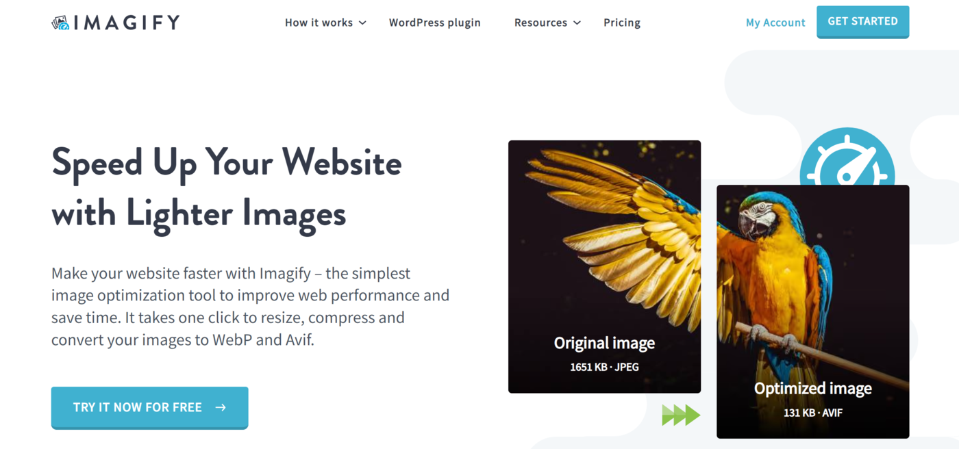
The exact configuration of the area above the fold will vary from site to site. For example, a software-as-a-service site typically includes its logo, navigation menu, headline, subheadline, and call to action in the above the fold section.
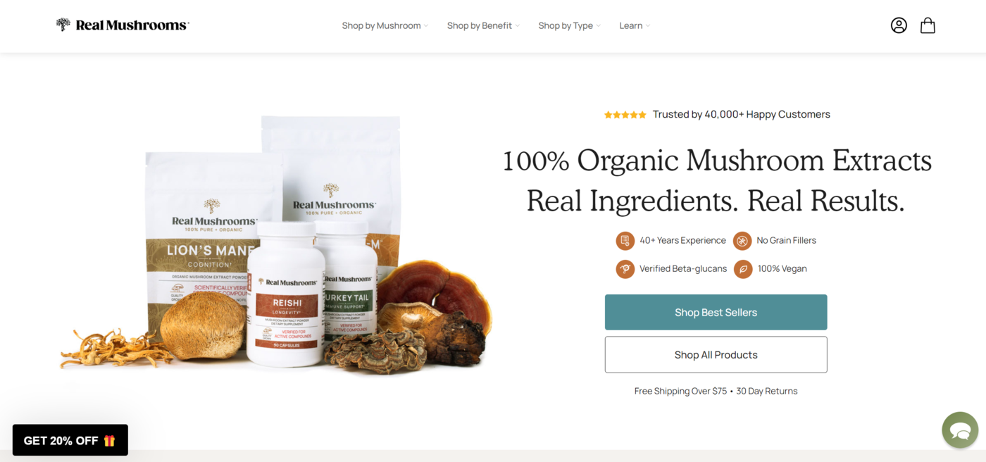
Meanwhile, an ecommerce site will include its logo, navigation menu, hero image, headline, testimonial, ratings, call to action, and offers.
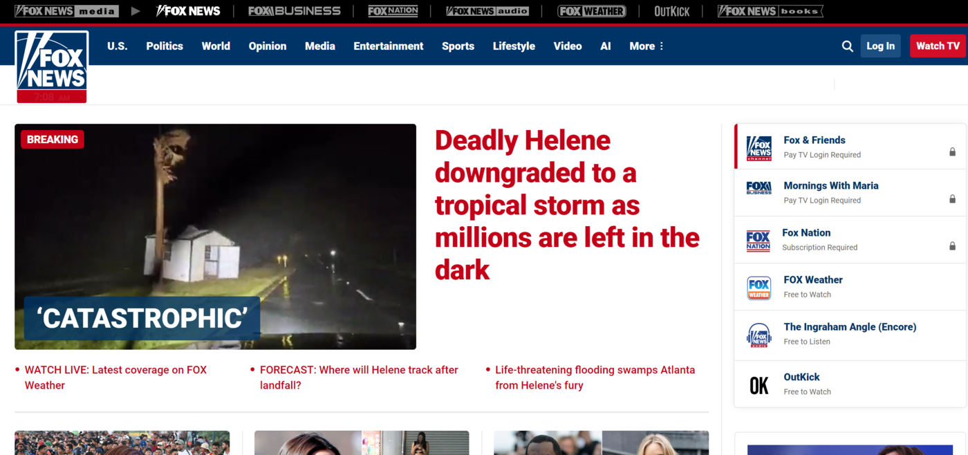
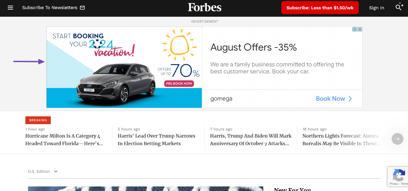
News sites typically include their logo, navigation menu, search bar, and major headlines. Some may also include weather forecasts.
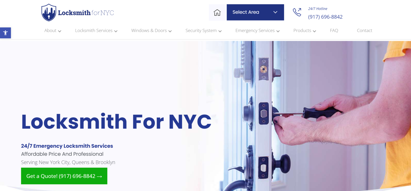
A service-based site typically includes a logo, navigation menu, and business contact details. It also includes the location, a hero image, and a headline and subheadline that mention the service offered. There is also a call to action that typically leads to a contact-us page.
Restaurants typically include one or more images of their menu in the above the fold section. They also typically have sidebars that contain their navigational menu. This sidebar lets visitors access their menu, opening times, and contact details. Sometimes, the contact details are also directly available in the above the fold section.
Above the Fold Best Practices
Many sites optimize their above the fold section for conversions. To get the most out of it, you should follow the above the fold best practices listed below.
1 Use a Catchy Headline
Include a clear and compelling page headline and subheadline above the fold. Ensure it is descriptive and concise. It should convey the main message or value of your site, product, or service to your target audience and encourage them to explore the page.
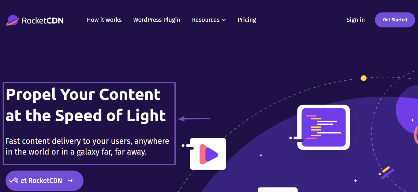
RocketCDN does this perfectly. The above the fold area of its homepage features a headline and subheadline that clearly inform visitors about what they do
2 Include a Call to Action
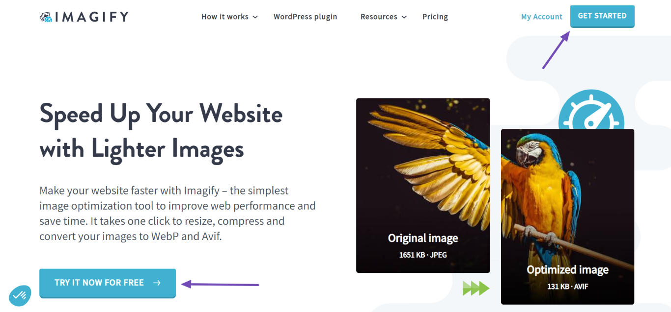
When necessary, the above the fold section should contain a call to action instructing the visitor on the next action to take. The specific call to action will differ from site to site. However, ensure that it works properly else it may lead to a poor gebruikerservaring.
3 Ensure Your Site Remains Usable
It is easy to load your site with excessive code, resources, and content when optimizing the above the fold section. You should avoid this and ensure your site remains usable and loads fast.
4 Reduce Clutter and Distractions
Avoid cluttering the above the fold section. Only include necessary content that is relevant to the page’s usability and intent. Reduce distractions and avoid including content that may overwhelm the visitor.
5 Avoid Creating False Bottoms
A false bottom occurs when visitors believe there is no content below the fold. This can happen for several reasons, such as excessive whitespace directly below the above the fold section or an overly large hero image that gives the impression there is no additional content.
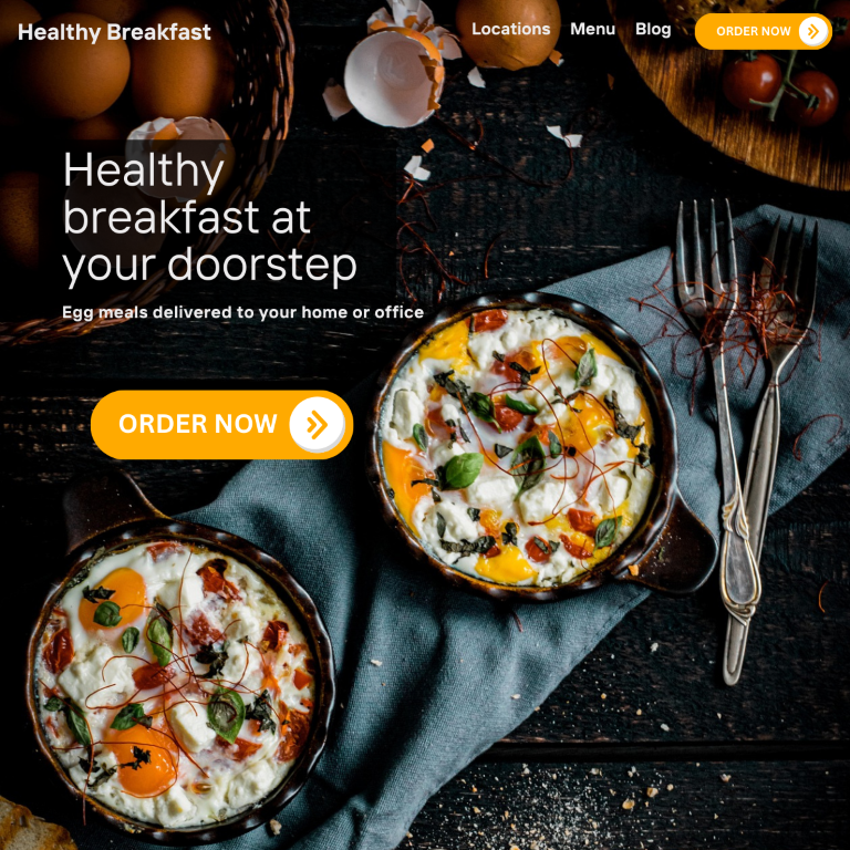
For example, the restaurant below uses an excessively large hero image that reaches the area below the fold. Visitors who scroll down the page may leave the site after thinking there is no content beyond the image.
6 Avoid Stuffing It With Too Many Ads
De Google Top Heavy update was a major algorithm update that penalized sites with too many ads in the area above the fold. If you have too many ads in the above the fold section, the update may limit your content’s ability to rank on zoekresultatenpagina's.
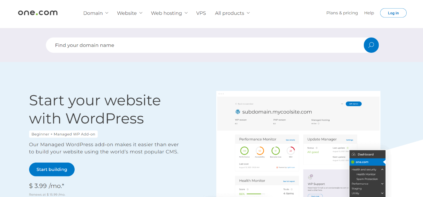
For example, this site features a single ad above the fold. The ad does not take up the entire space above the fold, allowing visitors to access the webpage’s content without needing to scroll.
