What is a Landing Page?
A landing page is a webpage visitors are directed to after clicking on a link from an ad, email, or webpage. It is typically created as part of a marketing or advertising campaign and is specifically designed to convert visitors into leads or customers.
Landing pages usually contain a call to action (CTA). This could be a text, image, button, or online form that encourages visitors to do something. It could be anything from getting the visitor to purchase a product, sign up for a newsletter, or download a resource.
For example, this landing page encourages visitors to submit their email addresses and begin a free trial of their software.
Difference Between a Homepage and a Landing Page
A homepage serves as the main entry point to a website, while a landing page is a page specifically created to convert website visitors into leads or customers.
Landing pages usually contain content specifically created to capture leads, drive sales, or promote an offer. They have a strong call to action and minimal distractions. Most landing pages even contain no options other than the call to action.
On the other hand, a homepage provides the visitor with an overview of the site. The homepage is the part of the site you access when you type something like https://yourdomain.com into your browser.
Homepages could be static or dynamic. Dynamic homepages are usually a compilation of the latest posts published on the site. They may contain a call to action, but it is less common when compared to static homepages.
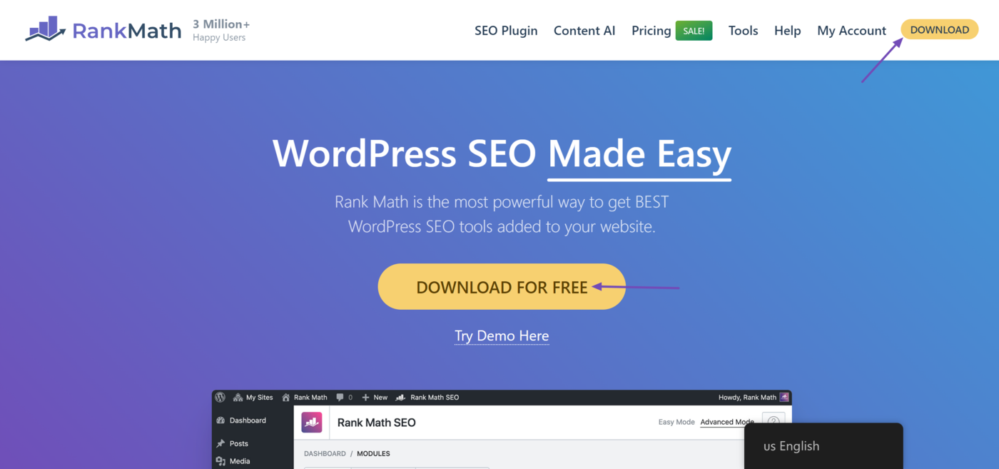
On the other hand, a static homepage typically details the services offered by the business that owns the site. They may sometimes look like a landing page and could contain a call to action. For example, this is what our homepage looks like. You can see it contains a call to action.
However, static homepages are not landing pages because they are usually created for a general audience. They also contain many links to other content and pages on the site. For example, you can see that the top part of our homepage contains links to other areas of our sites.
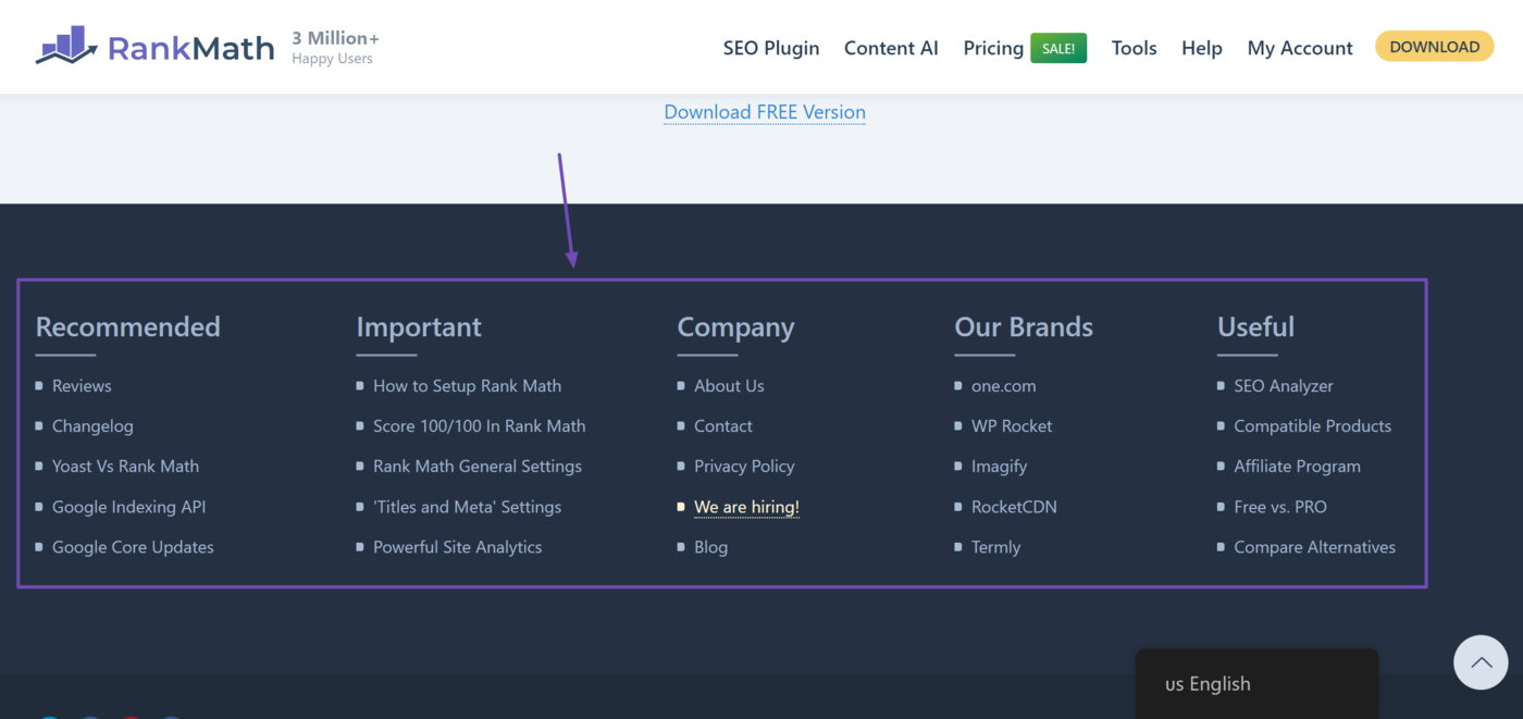
You will find more links on the main content and footer of the page.
Qualities of a Good Landing Page
Landing pages are created for conversions. While they are expected to have many qualities as you should expect from a regular webpage, they will typically have some extra attributes and functionality that may be missing from regular webpages.
1 Has One Focus
A good landing page is created for conversion. So, its only focus is to convert the visitor into a lead or customer.
Every link on a landing page will typically lead to the same signup form, download page, or purchase page. There is usually no link leading to any other page or resource. So, visitors can either interact with the call to action or close the page. There is no third option.
2 Clear and Compelling Headline
A good landing page begins with a clear and compelling headline that clearly communicates the product or service’s value to the visitor. It should grab their attention and entice them to read further.
3 Concise and Persuasive Copy
The copy on a landing page should be concise and focused on the benefits of the offer. It should clearly explain why the visitor should take action and contain persuasive words to encourage them to do so.
4 Strong Call-to-Action (CTA)
A call to action is a prompt or statement that encourages a visitor to take a specific action on a webpage. This could be to click a button, sign up for a service, or make a purchase.
A good landing page should contain a strong, clear, and persuasive call to action. The call to action is usually written in active verbs, for example, “Download Now” and “Start Your Free Trial.”
5 Relevant and High-Quality Visuals
Good landing pages usually contain relevant and high-quality visuals, such as images, videos, and infographics. For example, a landing page for a fitness program might include before-and-after photos of people who became fitter using the program.
6 Minimal Distractions
A good landing page minimizes distractions. It does not contain unnecessary elements that could divert attention from the primary goal of the page. This means no distracting visuals, headers, footers, sidebars, or unrelated content.
7 Trust Indicators
Landing pages usually contain multiple trust indicators. These could be testimonials, reviews, before-and-after photos, and certifications. These help to build credibility and reassure visitors about the legitimacy of the offer.
8 Fast Loading Speed
Landing pages should load quickly, typically within a few seconds. This is crucial for a positive user experience. It can also boost conversion rates, keep visitors engaged, and reduce bounce rates.
9 Mobile Responsiveness
A good landing page is mobile-friendly. It is responsive and functions well on all devices, regardless of screen size. Its layout adjusts seamlessly, and the CTA remains prominent and easy to click.
10 Easy Navigation
A landing page should have a simple and intuitive layout. The textual and visual content on the page should be properly formatted to ensure visitors can quickly find the information they need and take action without confusion.
11 Consistent Branding
The landing page should be consistent with the rest of the site’s pages. This is especially important as many sites create their landing pages using third-party services.
So, you should use the same color, font, and logos as you do on your site and other marketing materials. This helps to reinforce the site or business’s identity and build trust.


